Qtscreen uses QtVCP widgets for LinuxCNC integration.
Widget is the general name for the UI objects such as buttons and labels in PyQt.
You are free to use any available default widgets in the Qt Designer editor.
There are also special widgets made for LinuxCNC that make integration easier. These are split in two, heading on the right side of the editor:
-
One is for HAL only widgets.
-
The other is for CNC control widgets.
You are free to mix them in any way on your panel.
| This description of widget properties can easily be out of date due to further development and lack of people to write docs (a good way to give back to the project). The definitive descriptions are found by looking in the source code. |
1. HAL Only Widgets
These widgets usually have HAL pins and don’t react to the machine controller.
1.1. CheckBox Widget
This widget allows the user to check a box to set a HAL pin true or false.
It is based on PyQt’s QCheckButton.
1.2. DetachTabWidget - Container Widget With User Detachable Panels
This container widget works just like a QTabWidget -it displays multiple panels one at a time with tabs to select.
If you double click the tab or drag the tab, the tab will detach from the main window.
When a tab is detached, the contents are placed into a QDialog.
The tab can be re-attached by closing the dialog or by double clicking on its window frame.
It is based on PyQt’s QTabWidget.
1.3. DoubleScale - Spin Button Entry Widget
This widget is a spin button entry widget used for setting a s32 and float HAL pin.
It has an internal scale factor, set to a default of 1, that can be set programmatically or using a QtSignal.
The setInput slot can be connected to an integer, or a float signal.
-
[HALLabelName].setInput(some_value) -
This is a function call to change the internal scaling factor.
The HAL pins will be set to the value of the internal scale times the widget displayed value.
1.4. FocusOverlay - Focus Overlay Widget
This widget places a colored overlay over the screen, usually while a dialog is showing.
Used to create a focused feel and to draw attention to critical information.
It can also show a translucent image.
It can also display message text and buttons.
This widget can be controlled with STATUS messages.
1.5. Gauge - Round Dial Gauge Widget
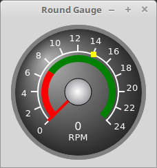
Round Gauge can be used in a LinuxCNC GUI to display an input parameter on the dial face.
There are several properties that are user settable in order to customize the appearance of the gauge.
The following parameters can be set either programmatically or via the Qt Designer property editor.
-
halpin_option -
Setting this to
Truewill create 2 HAL pins:-
One is for setting the
valueinput -
The other is for setting the
setpoint.
If this option is not set, then
valueandsetpointmust be connected programmatically, i.e., in the handler file. -
-
max_reading -
This value determines the highest number displayed on the gauge face.
-
max_value -
This is the maximum expected value of the value input signal.
In other words, it is the full scale input. -
num_ticks -
This is the number of ticks/gauge readings on the gauge face.
It should be set to a number that ensures the text readings around the gauge face are readable.
The minimum allowed value is 2. -
zone1_color -
Zone1 extends from the maximum reading to the threshold point.
It can be set to any RGB color. -
zone2_color -
Zone2 extends from the threshold point to the minimum reading, which is 0.
It can be set to any RGB color. -
bezel_color -
This is the color of the outer ring of the gauge.
-
bezel_width -
This is the width of the outer ring of the gauge.
-
threshold -
The threshold is the transition point between the zones.
It should be set to a value between 0 and the maximum value.
The maximum allowed value is set to the gauge’smax_valueand minimum value is 0. -
gauge_label -
This is the text below the value readout, near the bottom of the gauge.
The function of the gauge is then easily visible. -
base_color -
The color of the gauge.
-
base_gradient_color -
The highlight color of the gauge.
-
center_color -
The color of the center of the gauge.
-
center_gradient_color -
The highlight color of the center of the gauge.
There are 2 inputs that are not customizable. They can be set via HAL pins, programmatically or via signals from other widgets:
-
value -
This is the actual input value that will be displayed with the gauge needle and in the digital readout.
It must be set to a value between 0 andmax_valuemaximum value. -
setpoint -
This is a value that determines the location of a small marker on the gauge face. It must be set to a value between 0 and the maximum value.
1.6. GeneralHALInput - General Signals/Slots Input Connection Widget
This widget is used to connect an arbitrary Qt widget to HAL using signals/slots.
It is used for widgets that should respond to HAL pin changes.
1.7. GeneralHALOutput - General Signals/Slots Output Connection Widget
This widget is used to connect an arbitrary Qt widget to HAL using signals/slots.
It is used for widgets that should control HAL pins.
1.8. GridLayout - Grid Layout Widget
This widget controls if the widgets inside it are enabled or disabled.
Disabled widgets typically have a different color and do not respond to actions.
It is based on PyQt’s QGridLayout.
1.9. HalBar - HAL Bar Level Indicator
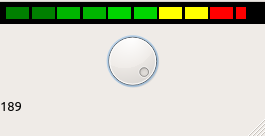
This widget is used to indicate level or value, usually of a HAL s32/float pin.
You can also disable the HAL pin and use Qt signals or Python commands to change the level.
1.9.1. Bar Properties
HalBar is a subclass of the Bar widget, so it inherits these properties:
-
stepColorList: a list of color strings, the number of colors defines the number of bars.
-
backgroundColor: a QColor definition of the background color.
-
indicatorColor: a QColor definition of the optional single color current value bar.
-
useMultiColorIndicator: bool switch for choosing the option of single or multicolor value bar.
-
split: the integer percentage split of max value bar versus current value bar (0 to 50%).
-
setVertical: bool switch for choosing vertical or horizontal indicator.
-
setInverted: bool switch for choosing inverted direction.
-
setMaximum: an integer that defines the maximum level of indication.
-
setMinimum: an integer that defines the lowest level of indication.
1.9.2. HalBar Properties
-
pinType: to select HAL pins type:
-
NONEno HAL pin will be added -
S32A S32 integer pin will be added -
FLOATA Float pin will be added
-
-
pinName: to change the HAL pin name otherwise the widget base name is used.
1.9.3. HalBar style sheets
The above Bar properties could be set in styles sheets.
pinType and pinName properties can not be changed in stylesheets.
| In style sheets, stepColorList is a single string of color names separated by commas. |
HalBar{
    qproperty-backgroundColor: #000;
    qproperty-stepColorList: 'green,green,#00b600,#00b600,#00d600,#00d600,yellow,yellow,red,red';
}
1.10. HALPad - HAL Buttons Joypad
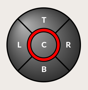
This widget looks and acts like a 5 buttons D-pad, with an LED ring.
Each button has an selectable type (Bit, S32 or Float) output HAL pin.
The LED center ring has selectable colors for off and on and is controlled by a bit HAL pin.
HALPad ENUMSThere are enumerated constants used:
-
To reference indicator positions:
-
NONE -
LEFT -
RIGHT -
CENTER -
TOP -
BOTTOM -
LEFTRIGHT -
TOPBOTTOM
-
-
For HAL pins type:
-
NONE -
BIT -
S32 -
FLOAT
-
You use the widget name in Qt Designer plus the reference constant:
self.w.halpadname.set_highlight(self.w.halpadname.LEFTRIGHT)
HALPad Properties-
pin_name -
Optional name to use for the HAL pins basename. If left blank, the Qt Designer widget name will be used.
-
pin_type -
Select the HAL output pin type. This property is only used at startup. Selection can be set in Qt Designer:
-
NONE -
BIT -
S32 -
FLOAT
-
-
left_image_path -
right_image_path -
center_image_path -
top_image_path -
bottom_image_path -
File or resource path to an image to display in the described button location.
If the reset button is pressed in the Qt Designer editor property, the image will not be displayed (allowing optional text). -
left_text -
right_text -
center_text -
top_text -
bottom_text -
A text string to be displayed in the described button location.
If left blank an image can be designated to be displayed. -
true_color -
false_color -
Color selection for the center LED ring to be displayed when the
<BASENAME>.light.centerHAL pin isTrueorFalse. -
text_color -
Color selection for the button text.
-
text_font -
Font selection for the button text.
HALPad StylesThe above properties could be set in styles sheets.
HALPad{
    qproperty-on_color: #000;
    qproperty-off_color: #444;
}
1.11. HALLabel - HAL Label Widget
This widget displays values sent to it.
Values can be sent from:
-
HAL pins
The input pin can be selected as Bit, S32, Float or no pin selected -
Programmatically
-
A
QtSignal
There is a textTemplate property to set the rich text and/or to format the text.
Basic formatting might be:
-
%rfor booleans -
%dfor integers -
%0.4ffor floats.
A rich text example might be:
self.w.my_hal_label.setProperty(textTemplate,"""
<html>
<head/>
<body>
  <p><span style="font-size:12pt;font-weight:600;color:#f40c11;">%0.4f</span></p>
</body>
</html>
"""
)
The setDisplay slot can be connected to an integer, a float or a bool signal.
If the property pin_name is not set the widget name will be used.
There are function calls to display values:
-
[HALLabelName].setDisplay(some_value) -
Can be used to set the display if no HAL pin is selected.
-
[HALLabelName].setProperty(textTemplate,"%d") -
Sets the template of the display.
It is based on PyQt’s QLabel.
1.12. LCDNumber - LCD Style Number Readout Widget
This widget displays HAL float/s32/bit values in a LCD looking way.
It can display numbers in decimal, hexadecimal, binary and octal formats by setting the mode property.
When using floats you can set a formatting string.
You must set the digitCount property to an appropriate setting to display the largest number.
-
pin_name -
Option string to be used as the HAL pin name.
If set to an empty string the widget name will be used. -
bit_pin_type -
Selects the input pin as type BIT.
-
s32_pin_type -
Selects the input pin as type S32.
-
float_pin_type -
Select the input pin as type
FLOAT. -
floatTemplate -
A string that will be used as a Python3 format template to tailor the LCD display.
Only used when aFLOATpin is selected, e.g.,{:.2f}will display a float rounded to 2 numbers after the decimal.
A blank setting will allow the decimal to move as required.
It is based on PyQt’s QLCDNumber.
1.13. LED - Indicator Widget

A LED like indicator that optionally follows a HAL pin’s logic.
-
halpin_option -
Selects if the LED follows an input HAL pin or program state.
-
diameter -
Diameter of the LED (defaults to 15).
-
color -
Color of the LED when on (defaults to green).
-
off_color -
Color of the LED when off (defaults to black).
-
gradient -
turns the gradient high light on or off (defaults to on).
-
on_gradient_color -
Color highlight of the LED when on (defaults to white).
-
off_gradient_color -
Color highlight of the LED when off (defaults to white).
-
alignment -
Qt alignment hint.
-
state -
Current state of LED
-
flashing -
Turns flashing option on and off.
-
flashRate -
Sets the flash rate.
The LED properties can be defined in a stylesheet with the following code added to the .qss file, name_of_led being the widget name defined in Qt Designer’s editor:
LED #name_0f_led{
  qproperty-color: red;
  qproperty-diameter: 20;
  qproperty-flashRate: 150;
}
1.14. PushButton - HAL Pin Toggle Widget
This widget allows a user to set a HAL pin true or false with the push of a button.
As an option it can be a toggle button.
For a LED Indicator Option, see [sub:qtvcp:widgets:indicatedpushbutton][IndicatedPushButton] below for more info.
It also has other options.
It is based on PyQt’s QPushButton.
1.15. RadioButton Widget
This widget allows a user to set HAL pins true or false. Only one RadioButton widget of a group can be true at a time.
It is based on PyQt’s QRadioButton.
1.16. Slider - HAL Pin Value Adjusting Widget
Allows one to adjust a HAL pin value using a sliding pointer.
1.17. TabWidget - Tab Widget
This widget allows the tab height to be adjusted with stylesheets.
The TabWidget properties can be defined in a stylesheet with the following code added to the .qss file.
name_of_tab being the widget name defined in Qt Designer’s editor.
If you omit the #name_of_tab text, all TabWidgets tab height will be set.
This shows how to set a particular widget’s tab height:
TabWidget #name_of_tab{
  qproperty-tabsize: 1.5;
}
It is based on PyQt’s QTabWidget.
1.18. WidgetSwitcher - Multi-widget Layout View Switcher Widget
This is used to switch the view of a multi-widget layout to show just one widget, i.e. to flip between a large view of a widget and a smaller multi widget view.
It is different from a stacked widget as it can pull a widget from anywhere in the screen and place it in its page with a different layout than it originally had.
The original widget must be in a layout for switcher to put it back.
In Qt Designer you will:
-
Add the
WidgetSwitcherwidget on screen. -
Right click the
WidgetSwitcherand add a page. -
Populate it with the widgets/layouts you wish to see in a default form.
-
Add as many pages as there are views to switch to.
-
On each page, add a layout widget.
After adding the layout you must right click the widget switcher again and set the layout option. -
Click on the
WidgetSwitcherwidget and then scroll to the bottom of the property editor. -
Look for the dynamic property
widget_listand double click to the right of it. -
A dialog pops up allowing you to add the names of the widgets to move to the pages you added to the
WidgetSwitcher.
There are function calls to display specific widgets.
By calling one of these functions, you control what widget is currently displayed:
-
[_WidgetSwitcherName_].show_id_widget(_number_) -
[_WidgetSwitcherName_].show_named_widget(_widget_name_) -
[_WidgetSwitcherName_].show_default() -
This shows the
page 0layout, and puts all other widgets back to where they were as initially built in Qt Designer. -
[_WidgetSwitcherName_].show_next() -
Show next widget.
It is based on the QStack widget.
1.19. XEmbed - Program Embedding Widget
Allows one to embed a program into the widget.
Only programs that utilize the xembed protocol will work such as:
-
GladeVCP virtual control panels
-
Onboard virtual keyboard
-
QtVCP virtual control panels
-
mplayer video player
2. Machine Controller Widgets
Disse skjermelementene samvirker med tilstanden til maskinkontrolleren.
2.1. ActionButton - Machine Controller Action Control Widget
These buttons are used for control actions on the machine controller.
They are built on top of IndicatedPushButton so can have LEDs overlaid.
| If you left double click on this widget you can launch a dialog to set any of these actions. The dialogs will help to set the right related data to the selected action. You can also change these properties directly in the property editor. |
You can select one of these:
-
Estop -
Machine On -
Auto -
mdi -
manual -
run -
run_from_line status -
Gets line number from
STATUSmessagegcode-line-selected. -
run_from_line slot -
Gets line number from Qt Designer int/str slot
setRunFromLine. -
abort -
pause -
load dialog -
Requires a dialog widget present.
-
Camview dialog -
Requires
camviewdialog widget present. -
origin offset dialog -
Requires origin offset dialog widget present.
-
macro dialog -
Requires macro dialog widget present.
-
Launch Halmeter -
Launch Status -
Launch Halshow -
Home -
Set the joint number to -1 for
all-home. -
Unhome -
Set the joint number to -1 for
all-unhome. -
Home Selected -
Homes the joint/axis selected by
STATUS. -
Unhome Selected -
Unhomes the joint/axis selected by
STATUS. -
zero axis -
zero G5X -
Zeros the current user coordinate system offsets.
-
zero G92 -
Zeros the optional
G92offsets. -
zero Z rotational -
Zeros the rotation offset.
-
jog joint positive -
Set the joint number.
-
jog joint negative -
Set the joint number.
-
jog selected positive -
Selected with a different widget or
STATUS. -
jog selected negative -
Selected with a different widget or
STATUS. -
jog increment -
Set metric/imperial/angular numbers.
-
jog rate -
Set the float/alt float number.
-
feed override -
Set the float/alt float number.
-
rapid override -
Set the float/alt float number.
-
spindle override -
Set the float/alt float number.
-
spindle fwd -
spindle backward -
spindle stop -
spindle up -
spindle down -
view change -
Set
view_type_string. -
limits override -
flood -
mist -
block delete -
optional stop -
mdi command -
Set
command_string, i.e.,calls a hard coded MDI command -
INI mdi number -
Set
ini_mdi_number, i.e., calls an INI based MDI command -
dro absolute -
dro relative -
dro dtg -
exit screen -
Closes down LinuxCNC
-
Override limits -
Temporarily override hard limits
-
launch dialogs -
Pops up dialogs if they are included in ui file.
-
set DRO to relative -
set DRO to absolute -
set DRO to distance-to-go -
These set attributes of the selected action (availability depends on the widget):
-
toggle float option -
Allows jog rate and overrides to toggle between two rates.
-
joint number -
Selects the joint/axis that the button controls.
-
incr imperial number -
Sets the imperial jog increment (set negative to ignore).
-
incr mm number -
Sets the metric jog increment (set negative to ignore).
-
incr angular number -
Sets the angular jog increment (set negative to ignore).
-
float number -
Used for
jograteand overrides. -
float alternate number -
For
jograteand overrides that can toggle between two float numbers. -
view type string -
Can be:
-
p, -
x,y,y2,z,z2, -
zoom-in,zoom-out, -
pan-up,pan-down,pan-left,pan-right, -
rotate-up,rotate-down,rotate-cw,rotate-ccw -
clear.
-
-
command string -
MDI command string that will be invoked if the MDI command action is selected.
-
ini_mdi_number -
(Legacy way)
A reference to the INI file[MDI_COMMAND_LIST]section.
Set an integer of select one line under the INI`s[MDI_COMMAND]line starting at 0.
Then in the INI file, under the heading[MDI_COMMAND_LIST]add appropriate lines.
Commands separated by the;will be run one after another
The button label text can be set with any text after a comma, the\nsymbol adds a line break. -
ini_mdi_key -
(preferred way)
A reference to the INI file[MDI_COMMAND_LIST]section.
This string will be added to MDI_COMMAND_ to form an entry to look for
in the INI file, under the heading[MDI_COMMAND_LIST].
Commands separated by the;will be run one after another
The button label text can be set with any text after a comma, the\nsymbol adds a line break.
[MDI_COMMAND_LIST]
MDI_COMMAND_MACRO0 = G0 Z25;X0 Y0;Z0, Goto\nUser\nZero
MDI_COMMAND_MACRO1 = G53 G0 Z0;G53 G0 X0 Y0, Goto\nMachn\nZero
Action buttons are subclassed from [sub:qtvcp:widgets:indicatedpushbutton][IndicatedPushButton]. See the following sections for more information about:
2.2. ActionToolButton - Optional Actions Menu Button Widget
ActionToolButton buttons are similar in concept to action buttons, but they use QToolButtons to allow for optional actions to be selected by pushing and holding the button till the option menu pops up.
Currently there is only one option: userView.
It is based on PyQt’s QToolButton.
userView Record and Set User View WidgetUser View tool button allows to record and return to an arbitrary graphics view.
Press and hold the button to have the menu pop up and press record view to record the currently displayed graphics view.
Click the button normally to return to the last recorded position.
The recorded position will be remembered at shutdown if a preference file option is set up.
| Due to programming limitations, the recorded position may not show exactly the same. Particularly, if you pan zoomed out and pan zoomed in again while setting the desired view. Best practice is to select a main view, modify as desired, record, then immediately click the button to switch to the recorded position. If it is not as you like, modify its existing position and re-record. |
2.3. AxisToolButton - Select and Set Axis Widget
This allows one to select and set an axis.
If the button is set checkable, it will indicate which axis is selected.
If you press and hold the button a pop up menu will show allowing one to:
-
Zero the axis
-
Divide the axis by 2
-
Set the axis arbitrarily
-
Reset the axis to the last number recorded
You must have selected an entry dialog widget that corresponds to the dialog_code_string, usually this is selected from the screenOptions widget.
-
halpin_option -
Will set a HAL pin true when the axis is selected.
-
joint_number -
Should be set to the appropriate joint number.
-
axis_letter -
Should be set to the appropriate axis letter.
These are the click-and-hold menu properties:
-
showLast -
Show the Set to last action.
-
showDivide -
Show the Divide by 2 action.
-
showGotoOrigin -
Show the Go to G53/G5x origin action.
-
showZeroOrigin -
Show the Zero Origin action.
-
showSetOrigin -
Show the Set Origin action.
-
dialog_code_string -
Sets which dialog will pop up with numerical entry, i.e. ENTRY or CALCULATOR to call a typing only entry dialog or a touch/typing calculator type entry dialog.
Here is a sample stylesheet entry:
AxisToolButton {
    /* Modify all the menu options */
    qproperty-showLast: false;
    qproperty-showDivide : true;
    qproperty-showGotoOrigin: true;
    qproperty-showZeroOrigin: true;
    qproperty-showSetOrigin: false;
    qproperty-dialog_code_string: CALCULATOR;
}
It is based on PyQt’s QToolButton.
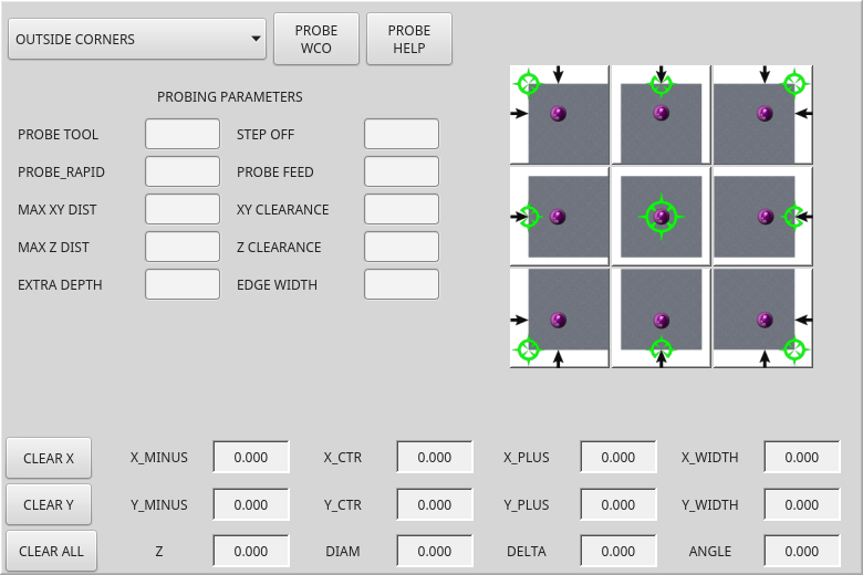
2.4. BasicProbe - Simple Mill Probing Widget
Widget for probing on a mill. Used by the QtDragon screen.
2.5. CamView - Workpiece Alignment and Origin Setting Widget
This widget displays a image from a web camera.
It overlays an adjustable circular and cross hair target over the image.
CamView was built with precise visual positioning in mind.
This is used to align the work piece or zero part features using a webcam.
It uses OpenCV vision library.
2.6. DROLabel - Axis Position Display Widget
This will display the current position of an axis.
You can also click on the label and see a list of actions.
-
Qjoint_number -
Joint index number (X=0 Y=1) of offset to display (10 will specify rotational offset).
-
Qreference_type -
Actual, relative or distance to go (0,1,2).
-
metric_template -
Format of display, e.g.
%10.3f. -
imperial_template -
format of display, e.g.
%9.4f. -
angular_template -
Format of display, e.g.
%Rotational: 10.1f. -
always_display_diameter -
Toggles display option
-
always_display_radius -
Toggles display option
-
display_as_per_m7m8 -
Toggles display option. Will follow the current M7/8 mode.
-
follow_reference_changes -
Toggles display option. Will follow the STATUS message reference mode, i.e. you can use Action buttons to set how it is currently displayed.
These are the click-on-menu options:
-
showLast -
Show the Set to last action.
-
showDivide -
Show the Divide by 2 action.
-
showGotoOrigin -
Show the Go to G53/G5x origin action.
-
showZeroOrigin -
Show the Zero Origin action.
-
showSetOrigin -
Show the Set Origin action.
-
dialogName -
Sets which dialog window will pop up with numerical entry, i.e. ENTRY or CALCULATOR.
The DROLabel widget holds a property isHomed that can be used with a stylesheet to change the color of the DRO_Label based on homing state of the joint number in LinuxCNC.
Here is a sample stylesheet entry that:
-
Sets the font of all
DRO_Labelwidgets, -
Sets the text template (to set resolution) of the DRO,
-
Then sets the text color based on the Qt
isHomedproperty. -
show all the menu options.
DROLabel {
    font: 25pt "Lato Heavy";
    qproperty-imperial_template: '%9.4f';
    qproperty-metric_template: '%10.3f';
    qproperty-angular_template: '%11.2f';

    /* Modify all the menu options */
    qproperty-showLast: true;
    qproperty-showDivide : true;
    qproperty-showGotoOrigin: true;
    qproperty-showZeroOrigin: true;
    qproperty-showSetOrigin: true;
    qproperty-dialogName: CALCULATOR;
}

DROLabel[isHomed=false] {
    color: red;
}

DROLabel[isHomed=true] {
    color: green;
}
Here is how you specify a particular widget by its objectName in Qt Designer:
DROLabel #dr0_x_axis [isHomed=false] {
    color: yellow;
}
It is based on PyQt’s QLabel.
2.7. FileManager - File Loading Selector Widget
This widget is used to select files to load.
It has a the ability to scroll the names with hardware such as a MPG.
One can class patch the function load(self,fname) to customize file loading.
The function getCurrentSelected() will return a Python tuple, containing the file path and whether it is a file.
temp = FILEMANAGER.getCurrentSelected()
print('filepath={}'.format(temp[0]))
if temp[1]:
    print('Is a file')
-
doubleClickSelection(bool) -
Determines whether or not to require double clicking on a folder.
Single clicking a folder (False) is enabled by default and is intended for touch screen users.
The following shows an example of how to set this property:#filemanager { qproperty-doubleClickSelection: True; }
-
showListView(bool) -
Determines whether or not to show the file/folder structure in list form.
Table view (False) is enabled by default.
The following shows an example of how to set this property:#filemanager { qproperty-showListView: True; }
It is based on PyQt’s FIXME
2.8. GcodeDisplay - G-code Text Display Widget
This displays G-code in text form, highlighting the currently running line.
This can also display:
-
MDI history when LinuxCNC is in
MDImode. -
Log entries when LinuxCNC is in
MANUALmode. -
Preference file entries if you enter
PREFERENCEin capitals into theMDILinewidget.
It has a signal percentDone(int) that can be connected to a slot (such as a progressBar to display percent run).
-
auto_show_mdi_status -
Set true to have the widget switch to MDI history when in MDI mode.
-
auto_show_manual_status -
Set true to have the widget switch to machine log when in Manual mode.
The GcodeDisplay properties can be set in a stylesheet with the following code added to the .qss file (the following color choices are random).
EditorBase{
    qproperty-styleColorBackground: lightblue;
    qproperty-styleColorCursor:white;
    qproperty-styleColor0: black;
    qproperty-styleColor1: #000000; /* black */
    qproperty-styleColor2: blue;
    qproperty-styleColor3: red;
    qproperty-styleColor4: green;
    qproperty-styleColor5: darkgreen;
    qproperty-styleColor6: darkred;
    qproperty-styleColor7: deeppink;
    qproperty-styleColorMarginText: White;
    qproperty-styleColorMarginBackground: blue;
    qproperty-styleFont0: "Times,12,-1,0,90,0,0,0,0,0";
    qproperty-styleFont1: "Times,18,-1,0,90,1,0,0,0,0";
    qproperty-styleFont2: "Times,12,-1,0,90,0,0,0,0,0";
    qproperty-styleFont3: "Times,12,-1,0,90,0,0,0,0,0";
    qproperty-styleFont4: "Times,12,-1,0,90,0,0,0,0,0";
    qproperty-styleFont5: "Times,12,-1,0,90,0,0,0,0,0";
    qproperty-styleFont6: "Times,12,-1,0,90,0,0,0,0,0";
    qproperty-styleFont7: "Times,12,-1,0,90,0,0,0,0,0";
    qproperty-styleFontMargin: "Times,14,-1,0,90,0,0,0,0,0";
}
For GcodeDisplay widget’s default G-code lexer:
-
styleColor0 = Default: Everything not part of the groups below
-
styleColor1 = LineNo and Comments: Nxxx and comments (characters inside of and including () or anything after ; (when used outside of parenthesis) with the exception of the note below)
-
styleColor2 = G-code: G and the digits after
-
styleColor3 = M-code: M and the digits after
-
styleColor4 = Axis: XYZABCUVW
-
styleColor5 = Other: EFHIJKDQLRPST (feed, rpm, radius, etc.)
-
styleColor6 = AxisValue: Values following XYZABCUVW
-
styleColor7 = OtherValue: Values following EFHIJKDQLRPST$
| For comments, the "OtherValue" color (Color 5) can be used to highlight "print," "debug," "msg," "logopen," "logappend," "logclose" "log," "pyrun," "pyreload" "abort," "probeopen" "probeclose" inside of a parenthesis comment in a line of G-code. As well as "py," if a line that starts with ";py,". Examples: (print, text), (log, text), (msg, text), or (debug, text). Only the last of the examples will be highlighted if there are more than one on the same line. |
Font definitions:
"style name, size, -1, 0, bold setting (0-99), italics (0-1),
underline (0-1),0,0,0"
It is based on PyQt’s QsciScintilla.
2.9. GcodeEditor - G-code Program Editor Widget
This is an extension of the GcodeDisplay widget that adds editing convenience.
It is based on PyQt’s QWidget which incorporates GcodeDisplay widget.
2.10. GCodeGraphics - G-code Graphic Backplot Widget
This displays the current G-code in a graphical form.
-
dro-font/dro-large-font(string) -
Sets the small and large DRO font properties
Here we reference with the widget base name; GCodeGraphics
GCodeGraphics{
    qproperty-dro_font:"monospace  bold 12";
}
GCodeGraphics{
    qproperty-dro_large_font:"Times 25";
}
-
_view(string) -
Sets the default view orientation on GUI load.
Valid choices for a lathe are p, y, y2. For other screens, valid choices are p, x, y, z, z2.
The following shows an example of how to set this property (referenced using the widget user selected name):#gcodegraphics{ qproperty-_view: z; }
-
_dro(bool) -
Determines whether or not to show the DRO.
The following shows an example of how to set this property:#gcodegraphics{ qproperty-_dro: False; }
-
_dtg(bool) -
Determine whether or not to show the Distance To Go.
The following shows an example of how to set this property:#gcodegraphics{ qproperty-_dtg: False; }
-
_metric(bool) -
Determines whether or not to show the units in metric by default.
The following shows an example of how to set this property:#gcodegraphics{ qproperty-_metric: False; }
-
_overlay(bool) -
Determines whether or not to show the overlay by default.
The following shows an example of how to set this property:#gcodegraphics{ qproperty-_overlay: False; }
-
_offsets(bool) -
Determines whether or not to show the offsets by default.
The following shows an example of how to set this property:#gcodegraphics{ qproperty-_offsets: False; }
-
_small_origin(bool) -
Determines whether or not to show the small origin by default.
The following shows an example of how to set this property:#gcodegraphics{ qproperty-_small_origin: False; }
-
overlay_color(primary, secondary, or RGBA formatted color) -
Sets the default overlay color.
The following shows an example of how to set this property:#gcodegraphics{ qproperty-overlay_color: blue; }
-
overlay_alpha(float) -
Sets the default overlay alpha value. This affects the opacity of the overlay when set between 0.0 and 1.0.
The following shows an example of how to set this property:#gcodegraphics{ qproperty-overlay_alpha: 0.15; }
-
background_color(primary, secondary, or RGBA formatted color) -
Sets the default background color.
The following shows an example of how to set this property:#gcodegraphics{ qproperty-background_color: blue; }
-
+_use_gradient_background+(bool) -
Determines whether or not use a gradient background by default.
The following shows an example of how to set this property:#gcodegraphics{ qproperty-_use_gradient_background: False; }
-
jog_color(primary, secondary, or RGBA formatted color) -
Sets the default jog color.
The following shows an example of how to set this property:#gcodegraphics{ qproperty-jog_color: red; }
-
Feed_color(primary, secondary, or RGBA formatted color) -
Sets the default feed color.
The following shows an example of how to set this property:#gcodegraphics{ qproperty-Feed_color: green; }
-
Rapid_color(primary, secondary, or RGBA formatted color) -
Sets the default rapid color.
The following shows an example of how to set this property:#gcodegraphics{ qproperty-Rapid_color: rgba(0, 0, 255, .5); }
-
InhibitControls(bool) -
Determines whether or not to inhibit external controls by default.
The following shows an example of how to set this property:#gcodegraphics{ qproperty-InhibitControls:True; }
-
MouseButtonMode(int) -
Changes the mouse button behavior to rotate, move or zoom within the preview.
The following shows an example of how to set this property:#gcodegraphics{ qproperty-MouseButtonMode: 1; }
There are 12 valid modes:
Mode
Move
Zoom
Rotate
0
Left
Middle
Right
1
Middle
Right
Left
2
Middle
Left
Right
3
Left
Right
Middle
4
Right
Left
Middle
5
Right
Middle
Left
Modes 6-11 are intended for machines that only require a 2D preview such as plasma or some lathes and have no rotate button assigned.
Mode
Move
Zoom
6
Left
Middle
7
Middle
Left
8
Right
Left
9
Left
Right
10
Middle
Right
11
Right
Middle
-
MouseWheelInvertZoom(bool) -
Determines whether or not to invert the zoom direction when zooming with the mouse wheel.
The following shows an example of how to set this property:#gcodegraphics{ qproperty-MouseWheelInvertZoom:True; }
ACTION functionsThe ACTION library can control the G-code graphics widget.
-
ACTION.RELOAD_DISPLAY() -
Reload the current program which recalculates the origin/offsets.
-
ACTION.SET_GRAPHICS_VIEW(_view_) -
The following
viewcommands can be sent:-
clear -
zoom-in -
zoom-out -
pan-up -
pan-down -
pan-right -
pan-left -
rotate-cw -
rotate-ccw -
rotate-up -
rotate-down -
overlay-dro-on -
overlay-dro-off -
overlay-offsets-on -
overlay-offsets-off -
alpha-mode-on -
alpha-mode-off -
inhibit-selection-on -
inhibit-selection-off -
dimensions-on -
dimensions-off -
grid-size -
record-view -
set-recorded-view -
P -
X -
Y -
Y2 -
Z -
Z2 -
set-large-dro
-
set-small-dro
-
-
ACTION.ADJUST_PAN(_X,Y_) -
Directly set the relative pan of view in x and y direction.
-
ACTION.ADJUST_ROTATE(_X,Y_) -
Directly set the relative rotation of view in x and y direction.
It is based on PyQt’s OpenGL widget.
2.11. JointEnableWidget - FIXME
FIXME JointEnableWidget documentation
2.12. JogIncrements - Jog Increments Value Selection Widget
This widget allows the user to select jog increment values for jogging.
The jogging values come from the INI file under:
-
[DISPLAY]INCREMENTS, or -
[DISPLAY]ANGULAR_INCREMENTS
This will be available to all widgets through STATUS.
You can select linear or angular increments by the property linear_option in Qt Designer property editor.
It is based on PyQt’s ComboBox.
2.13. MacroTab - Special Macros Widget
This widget allows a user to select and adjust special macro programs for doing small jobs.
It uses images for visual representation of the macro and for an icon.
It searches for special macros using the INI definition:
[RS274NGC]
SUBROUTINE_PATH =
The macros are O-word subroutines with special comments to work with the launcher. The first three lines must have the keywords below, the fourth is optional.
Here is a sample for the first four lines in an O-word file:
; MACROCOMMAND = Entry1,Entry2
; MACRODEFAULTS = 0,true
; MACROIMAGE = my_image.svg,Icon layer number,Macro layer number
; MACROOPTIONS = load:yes,save:yes,default:default.txt,path:~/macros
MACROCOMMANDThis is the first line in the O-word file.
It is a comma separated list of text to display above an entry.
There will be one for every variable required in the O-word function.
If the macro does not require variables, leave it empty:
; MACROCOMMAND=
MACRODEFAULTSThis must be the second line in the O-word file.
It is a comma separated list of the default values for each variable in the O-word function.
If you use the word radiotrue, radiofalse, true or false in the list, a *radiobutton* will be shown.
If you use the word checktrue or checkfalse in the list, a *checkbox* will be shown.
If you use the word buttontrue or buttonfalse in the list, a *Checkable Pushbutton* will be shown.
If the default has a decimal, macroTab assumes you want a float value otherwise an integer.
| When using radiobuttons, only set one radiobutton as true. Radio button are used for exclusive choices. |
MACROIMAGEThis must be the third line in the O-word file.
-
SVG Images
If using SVG image files, they must end with the.svgextension.
The images must be added to SVG layers which are used to define the different images for macro and icon.
Value is comma separated list of three ordered fields:
; MACROIMAGE=filename.svg,macro_layer_name[,icon_layer_name]
With:
-
_filename_.svg -
SVG image file name as first field.
It is assumed to be in the same folder as the O-word file. -
*macro_layer_name -
Macro image layer name as second field.
-
icon_layer_name -
Icon image layer name as optional third field. If the third entry is missing, the same image will be used for macro and icon.
-
-
PNG/JPG Images:
Value remains a comma separated list:; MACROIMAGE=macro_image.(png|jpg)[,icon_image.(png|jpg)]
With:
-
_macro_image_.(png|jpg) -
Macro image file name as first field.
It is assumed that the image file are in the same folder than the macro. -
_icon_image_.(png|jpg) -
Icon image file name as optional second field.
If the second entry is missing the same image will be used for macro and image.
-
If the keyword is present but the entries are missing, no images will be used.
MACROOPTIONSThis optional line must be the fourth line in the O-word file.
It is a comma separated list of keyword and data, all of which are optional:
-
LOAD:yes -
Shows a load button.
-
SAVE:yes -
Shows a save button.
-
DEFAULT:ThisMacroData.txt -
Sets the default preselected filename when loading/saving data for this macro.
It can be any valid filename but must end in .txt. -
PATH:~/linuxcnc/nc_files/mySavedMacrosData -
Sets the default directory folder to preselect when loading/saving data for this macro.
2.13.1. MacroTab Stylesheets
Here are stylesheet hints for adjusting the MacroTab widget.
MacroTab CustomButton{
    width: 20px;
    height: 40px;
}

MacroTab QPushButton {
    width: 80px;
    height: 40px;
}

MacroTab QLabel {
    font: 24pt "Lato Heavy";
}

TouchSpinBox  LineEdit {
    font: 12pt "Lato Heavy";
}

TouchSpinBox  QPushButton {
    width: 60px;
    height: 100px;
}
2.14. OperatorValueLine - Operator Value Line Entry Widget
The operator enters values into this widget, which will be applied to a template and then optionally issued to the MDI either immediately or applied at a later time. The widget supports the optional popup calculator, keyboard, or tool chooser for touchscreen-friendly entry by setting the dialog_keyboard_option. To change which type of dialog is presented, edit the dialog_code_option.
2.14.1. Formatting MDI Command
The widget supports a formatting option which is passed to Python’s string format() to produce the final output for the MDI command. The special token {value} can be inserted anywhere in this format string where the value should appear. The formatting property is called mdi_command_format_option, e.g.:
-
M3 S{value}to start the spindle at the speed entered by the operator. -
M6 T{value} G43 H{value}to issue a tool change and tool length offset change from the tool number entered
2.14.2. Automatic vs Deferred MDI Issue
The widget may be configured to automatically issue the MDI command upon submit when issue_mdi_on_submit_option is set to True. If False issuing the command may be done at a later time via a signal or function call from another widget.
In cases where issue_mdi_on_submit_option is False, calling the issue_mdi() function will issue the command. Slots attached to widgets such as PushButtons can trigger the MDI command when pressed, e.g.:
    def setSpindleSpeed(self, event):
        self.w.lineSpindleSpeed.issue_mdi()
        ACTION.SET_MANUAL_MODE()

    def setToolNumber(self, event):
        self.w.lineToolNumber.issue_mdi()
        ACTION.SET_MANUAL_MODE()
2.14.3. Pending State Styling Example
The widget tracks whether a value entered is pending and has not yet been issued via the property isPendingValue. This may be used to style the widget via the stylesheet. This can be used to alert the operator that they entered a value but another action must be taken to apply it.
The following style sheet excerpt will highlight the entry widget with a cyan background when values are pending and have not been applied.
#lineSpindleSpeed[isPendingValue=true],
#lineToolNumber[isPendingValue=true] {
    background: cyan;
}

#lineSpindleSpeed[isPendingValue=false],
#lineToolNumber[isPendingValue=false] {
    background: none;
}
2.15. MDILine - MDI Commands Line Entry Widget
One can enter MDI commands here.
A popup keyboard is available.
There are also embedded commands available from this widget.
Enter any of these case sensitive commands to load the respective program or access the feature:
-
HALMETER -
Starts LinuxCNC
halmeterutility. -
HALSHOW -
Starts LinuxCNC
halshowutility. -
HALSCOPE -
Starts LinuxCNC
halscopeutility. -
STATUS -
Starter LinuxCNC
status-verktøy. -
CALIBRATION -
Starter LinuxCNC kalibrering
-
CLASSICLADDER -
Starts the ClassicLadder GUI if the ClassicLadder realtime HAL component was loaded by the machine’s config files.
-
PREFERENCE -
Loads the preference file into the
GcodeEditor. -
CLEAR HISTORY -
Clears the MDI History.
-
net -
See
halcmd netcommands.
An error will result if the command is unsuccessful.-
Syntax:
net <signal name> <pin name> -
Eksempel:
net plasmac:jog-inhibit motion.jog-stop
-
-
setp -
Sets the value of a pin or a parameter.
Valid values depend on the object type of the pin or parameter.
It results in an error if the data types do not match or the pin is connected to a signal.-
Syntax:
setp <pin/parameter-name> <value> -
Example:
setp plasmac.resolution 100
-
-
unlinkp -
Disconnects a pin from a signal.
An error will result if the pin does not exist.
Running LinuxCNC from terminal may help determine the root cause as error messages fromhal_lib.cwill be displayed there.-
Syntax:
unlinkp <pin name> -
Example:
unlinkp motion.jog-stop
-
The MDILine function spindle_inhibit can be used by a GUI’s handler file to inhibit M3, M4, and M5 spindle commands if necessary. |
It is based on PyQt’s QLineEdit.
2.16. MDIHistory - MDI Commands History Widget
Displays a scrollable list of past MDI command.
An edit line is embedded for MDI commands. The same MDILine embedded commands may be accessed from this widget.
The history is recorded on a file defined in the INI under the heading [DISPLAY] (this shows the default):
MDI_HISTORY_FILE = '~/.axis_mdi_history'
2.17. MDITouchy - Touch Screen MDI Entry Widget
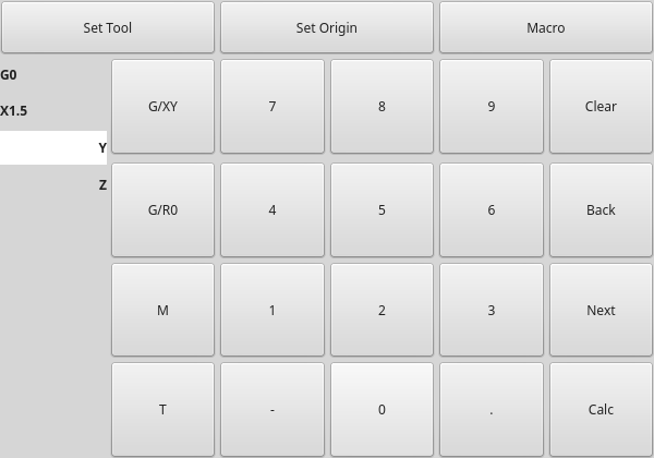
This widget displays buttons and entry lines to use for entering MDI commands.
Based on LinuxCNC’s Touchy screen’s MDI entry process, its large buttons are most useful for touch screens.
To use MDITouchy:
-
First press one of the
G/XY,G/RO,MorTbutton. On the left will show the entry fields that can be filled out. -
Then press
NextandBackto navigate between fields. -
Calcwill pop up a calculator dialog. -
Clearclears the current entry. -
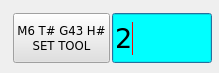
Set Toolwill call for a tool change. -
Set Originwill allow setting the origin of the current G6x system. -
Macrowill call any available macro ngc programs.
The widget requires an explicit call to MDITouchy Python code to actually run the MDI command:
-
For handler file code
If the widget was named mditouchy in Qt Designer, the command below would run the displayed MDI command:self.w.mditouchy.run_command()
-
For action button use
If the widget was named mditouchy in Qt Designer, use the action button’s Call Python commands option and enter:INSTANCE.mditouchy.run_command()
The macro button cycles though macros defined in the INI [DISPLAY] heading.
Add one or more MACRO lines of the following format:
MACRO = macro_name [param1] [... paramN]
In the example below, increment is the name of the macro, and it accepts two parameters, named xinc and yinc.
MACRO = incerment xinc yinc
Now, place the macro in a file named macro_name.ngc in the PROGRAM_PREFIX directory, or into any directory in the SUBROUTINE_PATH specified in the INI file.
Keeping on with the example above, it would be named increment.ngc and its content could look like:
O<increment> sub
G91 G0 X#1 Y#2
G90
O<increment> endsub
Notice the name of the sub matches the file name and macro name exactly, including case.
When you invoke the macro by pressing the Macro button you can enter values for parameters (xinc and yinc in our example).
These are passed to the macro as positional parameters: #1, #2… #N respectively.
Parameters you leave empty are passed as value 0.
If there are several different macros, press the Macro button repeatedly to cycle through them.
In this simple example, if you enter -1 for xinc and invoke the running of the MDI cycle, a rapid G0 move will be invoked, moving one unit to the left.
This macro capability is useful for edge/hole probing and other setup tasks, as well as perhaps hole milling or other simple operations that can be done from the panel without requiring specially-written G-code programs.
2.18. OriginOffsetView - Origins View and Setting Widget
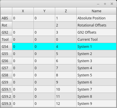
This widget allows one to visualize and modify User System Origin offsets directly.
It will update LinuxCNC’s Parameter file for changes made or found.
The settings can only be changed in LinuxCNC after homing and when the motion controller is idle.
The display and entry will change between metric and imperial, based on LinuxCNC’s current G20 / G21 setting.
The current in-use user system will be highlighted.
Extra actions can be integrated to manipulate settings.
These actions depend on extra code added either to a combined widget, like originoffsetview dialog, or the screens handler code.
Typical actions might be Clear Current User offsets or Zero X.
Clicking on the columns and rows allows one to adjust the settings.
A dialog can be made to popup for data or text entry.
The comments section will be recorded in the preference file.
It is based on PyQt’s QTableView, QAbstractTableModel, and ItemEditorFactory.
Properties, functions and styles of the PyQt base objects are always available.
OriginOffsetView has the following properties:
-
dialog_code_string -
Sets which dialog will pop up with numerical entry.
-
test_dialog_code_string -
Sets which dialog will pop up with text entry.
-
metric_template -
Metric numerical data format.
-
imperial_template -
Imperial numerical data format.
-
styleCodeHighlight -
Current in-use user system highlight color.
These can be set in:
-
Qt Designer, in
-
Python handler code
self.w.originoffsetview.setProperty('dialog_code','CALCULATOR')
self.w.originoffsetview.setProperty('metric_template','%10.3f')
-
Or (if appropriate) in stylesheets
OriginOffsetView{
  qproperty-styleColorHighlist: lightblue;
}
2.19. RadioAxisSelector - FIXME
FIXME RadioAxisSelector documentation
2.20. RoundButton - Round Shapped ActionButton Widget
Round buttons work the same as ActionButtons other than the button is cropped round.
They are intended only to be visually different.
They have two path properties for displaying images on true and false.
2.21. StateLabel - Controller Modes State Label Display Widget
This will display a label based on the machine controller modes true/false states.
You can select between different texts based on true or false.
The states are selectable via these properties:
-
css_mode_status -
Truewhen machine is inG96Constant Surface Speed Mode. -
diameter_mode_status -
Truewhen machine is inG7Lathe Diameter Mode. -
fpr_mode_status -
Truewhen machine is inG95Feed per revolution Mode. -
metric_mode_status -
Truewhen machine is inG21Metric Mode.
-
true_textTemplate -
This will be the text set when the option is
True.
You can use Qt rich text code for different fonts/colors etc.
Typical template for metric mode in true state, might be: Metric Mode -
false_textTemplate -
This will be the text set when the option is
False.
You can use Qt rich text code for different fonts/colors etc.
Typical template for metric mode in false state, might be: Imperial Mode.
It is based on PyQt’s QLabel.
2.22. StatusLabel - Controller Variables State Label Display Widget
This will display a label based on selectable status of the machine controller.
You can change how the status will be displayed by substituting Python formatting code in the text template. You can also use rich text for different fonts/colors etc.
These states are selectable:
-
actual_spindle_speed_status -
Used to display the actual spindle speed as reported from the HAL pin
spindle.0.speed-i.
It’s converted to RPM.
AtextTemplateof%dwould typically be used. -
actual_surface_speed_status -
Used to display the actual cutting surface speed on a lathe based on X axis and spindle speed.
It’s converted to distance per minute.
AtextTemplateof%4.1f(feet per minute) andaltTextTemplateof%d(meters per minute) would typically be used. -
blendcode_status -
Shows the current
G64setting. -
current_feedrate_status -
Shows the current actual feedrate.
-
current_FPU_status -
Shows the current actual feed per unit.
-
fcode_status -
Shows the current programmed
Fcode setting. -
feed_override_status -
Shows the current feed override setting in percent.
-
filename_status -
Shows the last loaded file name.
-
filepath_status -
Shows the last loaded full file path name.
-
gcode_status -
Shows all active G-codes.
-
gcode_selected_status -
Show the current selected G-code line.
-
halpin_status -
Shows the HAL pin output of a selected HAL pin.
-
jograte_status -
Shows the current QtVCP based Jog Rate.
-
jograte_angular_status -
Shows the current QtVCP based Angular Jog Rate.
-
jogincr_status -
Shows the current QtVCP based Jog increment.
-
jogincr_angular_status -
Shows the current QtVCP based Angular Jog increment.
-
machine_state_status -
Shows the current machine interpreter state using the text described from the machine_state_list.
The interpreter states are:-
Estopped -
Running -
Stopped -
Paused -
Waiting -
Reading
-
-
max_velocity_override_status -
Shows the current max axis velocity override setting.
-
mcode_status -
Shows all active M-codes.
- motion_type_status
-
Shows current type of machine motion using the text described from the motion_type_list.
-
None
-
Rapid
-
Feed
-
Arc
-
Tool Change
-
Probe
-
Rotary Index
-
-
requested_spindle_speed_status -
Shows the requested spindle speed - actual may be different.
-
rapid_override_status -
Shows the current rapid override setting in (0-100) percent.
-
spindle_override_status -
Shows the current spindle override setting in percent.
-
timestamp_status -
Shows the time based on the system settings.
An example of a usefultextTemplatesetting:%I:%M:%S %p.
See the Python time module for more info. -
tool comment_status -
Returns the comment text from the current loaded tool.
-
tool diameter_status -
Returns the diameter from the current loaded tool.
-
tool_number_status -
Returns the tool number of the current loaded tool.
-
tool_offset_status -
Returns the offset of the current loaded tool, indexed by
index_numberto select axis (0=x,1=y,etc.). -
user_system_status -
Shows the active user coordinate system (
G5xsetting).
-
index_number -
Integer that specifies the tool status index to display.
-
state_label_list -
List of labels used to describe different machine states.
- motion_label_list
-
List of labels used to describe different motion types.
-
halpin_names -
Name of a halpin to monitor (must be the complete name, including the HAL component basename).
-
textTemplate -
This is usually used for imperial (
G20) or angular numerical settings, though not every option has imperial/metric conversion.
This uses Python formatting rules to set the text output.
One can use%sfor no conversion,%dfor integer conversion,%ffor float conversion, etc.
You can also use Qt rich text code.
Typical template used for formatting imperial float numbers to text would be%9.4for%9.4f inch. -
alt_textTemplate -
This is usually used for metric (
G21) numerical settings.
This uses Python formatting rules to set the text output.
Typical template used for formatting metric float to text would be%10.3for%10.3f mm.
It is based on PyQt’s QLabel.
2.23. StatusImageSwitcher - Controller Status Image Switcher
Status image switcher will switch between images based on LinuxCNC states.
-
*
watch_spindle -
Toggles between 3 images:
stop,fwd,revs. -
*
watch_axis_homed -
Toggles between 2 images:
axis not homed,axis homed. -
*
watch_all_homed -
Would toggle between 2 images:
not all homed,all homed. -
*
watch_hard_limits -
Would toggle between 2 images or one per joint.
Here is an example of using it to display an icon of Z axis homing state:
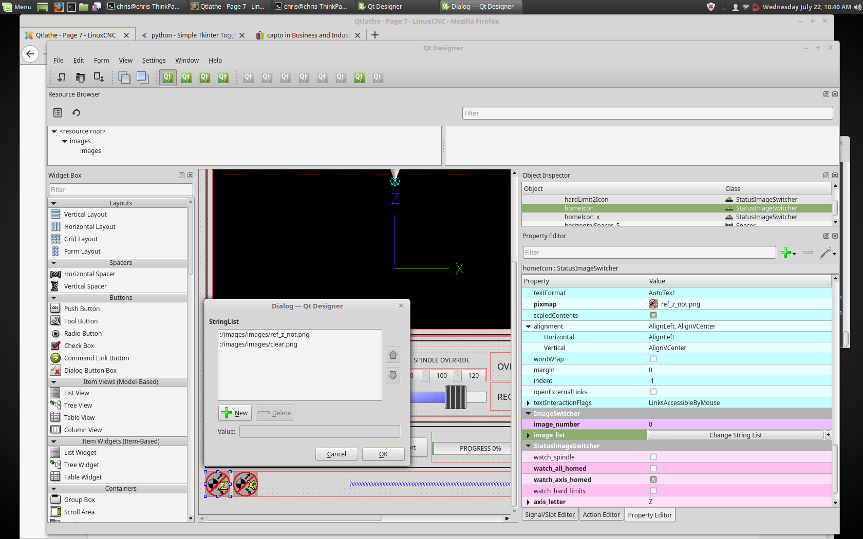
In the properties section notice that:
-
watch_axis_homedis checked -
axis_letteris set to Z
If you double click the image_list a dialog will show and allow you to add image paths to.
If you have one image as an icon and one clear image then that will look like it shows and hides the icon.
Selecting image paths can be done by selecting the pixmap property and selecting an image.
The pixmap setting is for test display only and will be ignored outside of Qt Designer. |
-
Right click the image name and you should see Copy path.
-
Click Copy path.
-
Now double click the image list property so the dialog shows.
-
Click the New button.
-
Paste the image path in the entry box.
Do that again for the next image.
Use a clear image to represent a hidden icon.
You can test the images display from the image list by changing the image number. In this case 0 is unhomed and 1 would be homed.
This is for test display only and will be ignored outside of Qt Designer.
2.24. StatusStacked - Mode Status Display Switching Widget
This widget displays one of three panels based on LinuxCNC’s mode.
This allows you to automatically display different widgets on Manual, MDI and Auto modes.
It is based on PyQt’s QStacked widget.
2.25. ScreenOption - General Options Setting widget
This widget doesn’t add anything visually to a screen but sets up important options.
This is the preferred way to use these options.
These properties can be set in Qt Designer, in Python handler code or (if appropriate) in stylesheets.
These include:
-
halCompBaseName -
If left empty QtVCP will use the screen’s name as the HAL component’s basename.
If set, QtVCP will use this string as the HAL component’s basename.
If the-ccommand line option is used when loading QtVCP, it will use the name specified on the command line - it overrides all above options.
If you programmatically set the basename in thehandlerfile- it will override all above options.
This property cannot be set in stylesheets. -
notify_option -
Hooking into the desktop notification bubbles for error and messages.
-
notify_max_messages -
Number of messages shown on screen at one time.
-
catch_close_option -
Catching the close event to pop up a 'are you sure' prompt.
-
close_overlay_color -
Color of transparent layer shown when quitting.
-
catch_error_option -
Monitoring of the LinuxCNC error channel.
This also sends the message throughSTATUSto anything that registers. -
play_sounds_option -
Playing sounds using
beep,espeakand the system sound. -
use_pref_file_option -
Setting up a preferences file path.
Using the magic wordWORKINGFOLDERin the preference file path will be replaced with the launched configuration path, e.g.WORKINFOLDER/my_preferences. -
use_send_zmq_option -
Used to initiate ZMQ based outgoing messages.
-
use_receive_zmq_messages -
Used to initiate ZMQ based in coming messages.
These messages can be used to call functions in the handler file, allowing external programs to integrate tightly with QtVCP based screens. -
embedded_program_option -
Embed programs defined in the INI.
-
default_embed_tab -
This is the property for a default location to embed external programs.
It should be set to name of a tab page widget in Qt Designer. -
focusOverlay_option -
Focus_overlay will put a transparent image or colored panel over the main screen to emphasize focus to an external event - typically a dialog.
-
messageDialog_option -
Sets up the message dialog - used for general messages.
-
message_overlay_color -
Color of transparent layer shown when the message dialog is shown.
-
closeDialog_option -
Sets up the standard close screen prompt dialog.
-
entryDialog_option -
Sets up the numerical entry dialog.
-
entryDialogSoftKey_option -
Sets up a floating software keyboard when entry dialog is focused.
-
entry_overlay_color -
Color of transparent layer shown when the entry dialog is shown.
-
toolDialog_option -
Sets up the manual tool change dialog, including HAL pin.
-
tool_overlay_color -
Color of transparent layer shown when the tool dialog is shown.
-
ToolUseDesktopNotify -
Option to use desktop notify dialogs for manual tool change dialog.
-
ToolFrameless -
Frameless dialogs can not be easily moved by users.
-
fileDialog_option -
Sets up the file choosing dialog.
-
file_overlay_color -
Color of transparent layer shown when the file dialog is shown.
-
keyboardDialog_option -
Sets up a keyboard entry widget.
-
keyboard_overlay_color -
Color of transparent layer shown when the keyboard dialog is shown.
-
vesaProbe_option -
Sets up the Versa style probe dialog.
-
versaProbe_overlay_color -
Color of transparent layer shown when the
versaProbedialog is shown. -
macroTabDialog_option -
Sets up the macro selection dialog.
-
macroTab_overlay_color -
Color of transparent layer shown when the
macroTabdialog is shown. -
camViewDialog_option -
Sets up the camera alignment dialog.
-
camView_overlay_color -
Color of transparent layer shown when the
camViewdialog is shown. -
toolOffset_option -
Sets up the tool offset display/editor dialog.
-
toolOffset_overlay_color -
Color of transparent layer shown when the
toolOffsetdialog is shown. -
originOffset_option -
Sets up the origin display/editor dialog.
-
originOffset_overlay_color -
Color of transparent layer shown when the
originOffsetdialog is shown. -
calculatorDialog_option -
Sets up the calculator entry dialog.
-
calculator_overlay_color -
Color of transparent layer shown when the calculator dialog is shown.
-
machineLogDialog_option -
Sets up a dialog to display logs from the machine and QtVCP.
-
machineLog_overlay_color -
Color of transparent layer shown when the
machineLogdialog is shown. -
runFromLineDialog_option -
Sets up a dialog to display starting options when starting machine execution from a arbitrary line.
-
runFromLine_overlay_color -
Color of transparent layer shown when the
runFromLinedialog is shown. -
user1Color -
Optional color the screen designer can use in their design.
-
user2Color -
Optional color the screen designer can use in their design.
-
user3Color -
Optional color the screen designer can use in their design.
-
user4Color -
Optional color the screen designer can use in their design.
-
user5Color -
Optional color the screen designer can use in their design.
-
user6Color -
Optional color the screen designer can use in their design.
-
user7Color -
Optional color the screen designer can use in their design.
-
user8Color -
Optional color the screen designer can use in their design.
-
user9Color -
Optional color the screen designer can use in their design.
-
user10Color -
Optional color the screen designer can use in their design.
The screen designer chooses the default settings of the screenOptions widget.
Once chosen, most won’t ever need to be changed. But if needed, some can be changed in the handler file or in stylesheets.
-
In the handler file:
Here we reference the widget by the Qt Designer user defined name:# rød, grønn, blå, alfa 0-255 color = QtGui.QColor(0, 255, 0, 191) self.w.screen_options.setProperty('close_overlay_color', color) self.w.screen_options.setProperty('play_sounds_option',False)
-
In style sheets:
Here we can reference the widget by Qt Designer user defined name or by widget class name./* red, green, blue 0-255, alpha 0-100% or 0.0 to 1.0 */ /* the # sign is used to refer to Qt Designer defined widget name */ /* matches/applied to only this named widget */ #screen_options { qproperty-close_overlay_color: rgba(0, 255, 0, 0.75) }
Some settings are only checked on startup so will not cause changes after startup. In these cases you would need to make the changes in Qt Designer only.
If the preference file option is selected, screenOption widget will make an INI based preference file.
While other QtVCP widgets will add to this list, the screenOptions widget will add these entries under the following headings:
-
[SCREEN_OPTIONS] -
-
catch_errors(bool) -
desktop_notify(bool) -
Whether to display errors/messages in the system’s notification mechanism.
-
notify_max_msgs(int) -
Number of displayed errors at one time.
-
shutdown_check(bool) -
Whether to pop a confirmation dialog.
-
sound_player_on(bool) -
Turns all sounds on or off.
-
-
[MCH_MSG_OPTIONS] -
-
mchnMsg_play_sound(bool) -
To play alert sound when dialog pops.
-
mchnMsg_speak_errors(bool) -
To use Espeak to speak error messages.
-
mchnMsg_speak_text(bool) -
To use Espeak to speak all other messages.
-
mchnMsg_sound_type(str) -
Sound to play when messages displayed. See notes below.
-
-
[USER_MSG_OPTIONS] -
-
usermsg_play_sound(bool) -
To play alert sound when dialog pops.
-
userMsg_sound_type(str) -
Sound to play when user messages displayed. See notes below.
-
userMsg_use_focusOverlay(bool)
-
-
[SHUTDOWN_OPTIONS] -
-
shutdown_play_sound(bool) -
shutdown_alert_sound_type(str) -
Sound to play when messages displayed. See notes below.
-
shutdown_exit_sound_type(str) -
Sound to play when messages displayed. See notes below.
-
shutdown_msg_title(str) -
Short title string to display in dialog.
-
shutdown_msg_focus_text(str) -
Large text string to superimpose in focus layer.
-
shutdown_msg_detail(str) -
Lengre beskrivelsesstreng som vises i dialog.
-
-
NOTIFY_OPTIONS -
-
notify_start_greeting(bool) -
Whether to display a greeting dialog on start-up.
-
notify_start_title(str) -
Short Title string.
If the speak option is also selected it will be spoken with Espeak. -
notify_start_detail(str) -
Lengre beskrivelsesstreng.
-
notify_start_timeout(int) -
Time in seconds to display before closing.
-
*_sound_type entries-
System Sounds
In Debian/Ubuntu/Mint based installations these system sounds should be available as sound-type entries above:-
ERROR -
READY -
DONE -
ATTENTION -
RING -
LOGIN -
LOGOUT -
BELL
These Sound options require
python3-gst1.0installed. -
-
Audio Files
You can also specify a file path to an arbitrary audio file.
You can use~in path to substitute for the user home file path. -
Kernel Beeps
If thebeepkernel module is installed and it is not disabled, these sound-type entries are available:-
BEEP -
BEEP_RING -
BEEP_START
-
-
Text-To-Speech
If the Espeak module (python3-espeak) is installed, you can use theSPEAKentry to pronounce text: -
SPEAK '_my message_'
2.26. StatusSlider - Controller Setting Adjustment Slider Widget
This widget allow the user to adjust a LinuxCNC setting via a slider.
The widget can adjust:
-
Jog rate
-
Angular jog rate
-
Feed rate
-
Spindle override rate
-
Rapid override rate
StatusSlider has the following properties:
-
halpin_option -
Sets option to make a HAL float pin that reflects current value.
-
rapid_rate -
Selects a rapid override rate slider.
-
feed_rate -
Selects a feed override rate slider.
-
spindle_rate -
Selects a spindle override rate slider.
-
jograte_rate -
Selects a linear jograte slider.
-
jograte_angular_rate -
Selects a angular jograte slider.
-
max_velocity_rate -
Selects a maximum velocity rate slider.
-
alertState -
String to define style change:
read-only,under,overandnormal. -
alertUnder -
Sets the float value that signals the stylesheet for under warning.
-
alertOver -
Sets the float value that signals the stylesheet for over warning.
These can be set in:
-
Qt Designer
-
Python handler code,
self.w.status_slider.setProperty('spindle_rate',True)
self.w.status_slider.setProperty('alertUnder',35)
self.w.status_slider.setProperty('alertOver',100)
-
Or (if appropriate) in stylesheets.
/* warning colors for overrides if out of normal range*/
/* widget object name is slider_spindle_ovr */

#slider_spindle_ovr[alertState='over'] {
    background: red;
}
#slider_spindle_ovr[alertState='under'] {
    background: yellow;
}
It is based on PyQt’s QSlider.
2.27. StateLED - Controller State LED Widget
This widget gives status on the selected LinuxCNC state.
The state options are:
-
is_paused_status -
is_estopped_status -
is_on_status -
is_idle_status_ -
is_homed_status -
is_flood_status -
is_mist_status -
is_block_delete_status -
is_optional_stop_status -
is_joint_homed_status -
is_limits_overridden_status -
is_manual_status -
is_mdi_status -
is_auto_status -
is_spindle_stopped_status -
is_spindle_fwd_status -
is_spindle_rev_status -
is_spindle_at_speed_status -
is_neg_limit_tripped -
is_pos_limit_tripped -
is_limits_tripped -
There are properties that can be changed:
-
halpin_option -
Adds an output pin that reflects selected state.
-
invert_state_status -
Invert the LED state compared to the LinuxCNC state.
-
diameter -
LED-ens diameter.
-
color -
Color of the LED when on.
-
off_color -
Color of the LED when off.
-
alignment -
Qt Alignment hint.
-
state -
Current state of LED (for testing in Qt Designer).
-
flashing -
Turns flashing option on and off.
-
flashRate -
Sets the flash rate.
The LED properties can be defined in a stylesheet with the following code added to the .qss file.
State_LED #name_of_led{       <1>
  qproperty-color: red;
  qproperty-diameter: 20;
  qproperty-flashRate: 150;
}
-
name_of_ledwould be the name defined in Qt Designer’s editor.
It is based on the LED widget.
2.28. StatusAdjustmentBar - Controller Value Setting Widget
This widget allows setting values using buttons while displaying a bar.
It also has an optional hi/low toggle button that can be held down to set the levels.
The widget can adjust:
-
Jog rate
-
Angular jog rate
-
Feed rate
-
Spindle override rate
-
Rapid override rate
It is based on PyQt’s QProgressBar.
2.29. SystemToolButton - User System Selection Widget
This widget allows you to manually select a G5x user system by pressing and holding.
If you don’t set the button text it will automatically update to the current system.
It is based on PyQt’s QToolButton.
2.30. StateEnableGridlayout - Controller State Enabled Container Widget
_disable the widgets inside it depending on LinuxCNC's current state_.This is a container that other widgets can be placed in.
Embedded widgets are be greyed-out when the StateEnableGridlayout is disabled.
It can selectably react to:
-
Machine on
-
Interpreter idle
-
E-stop off
-
All-homed
It is based on PyQt’s QGridLayout.
2.31. StatusImageSwitcher - Controller Status Image Switching Widget
This widget will display images based on LinuxCNC status.
You can watch:
-
the state of the spindle,
-
the state of all homed,
-
the state of a certain axis homed,
-
tilstanden for harde grenser.
It is based on PyQt’s FIXME
2.32. ToolOffsetView - Tools Offsets View And Edit Widget
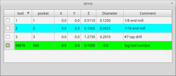
This widget displays and allows one to modify tools offsets.
It will update LinuxCNC’s tool table for changes made or found.
The tool settings can only be changed in LinuxCNC after homing and when the motion controller is idle.
The display and entry will change between metric and imperial based on LinuxCNC’s current G20/G21 setting.
The current in-use tool will be highlighted, and the current selected tool will be highlighted in a different color.
The checkbox beside each tool can be used to select too for an action that depends on extra code added either to a combined widget, like the toolOffsetView dialog or the screens handler code.
Typical actions are load selected tool, delete selected tools, etc.
Clicking on the columns and rows allows one to adjust the settings.
A dialog can be made to popup for data or text entry.
The comments section will typically be displayed in the manual tool change dialog.
If using a lathe configuration, there can be columns for X and Z wear.
To use these columns to adjust the tool wear, it requires a remapped tool change routine.
It is based on PyQt’s QTableView, QAbstractTableModel, and ItemEditorFactory.
Properties, functions and styles of the PyQt base objects are always available.
ToolOffsetView has properties that can be set in Qt Designer, in Python handler code or (if appropriate) in stylesheets:
-
dialog_code_string -
Sets which dialog will pop up with numerical entry.
-
text_dialog_code_string -
Sets which dialog will pop up with text entry.
-
metric_template -
Metric numerical data format.
-
imperial_template -
Imperial numerical data format.
-
styleCodeHighlight -
Current tool-in-use highlight color.
-
styleCodeSelected -
Selected highlight color.
In a handler file:
self.w.tooloffsetview.setProperty('dialog_code','CALCULATOR')
self.w.tooloffsetview.setProperty('metric_template','%10.3f')
and in style sheets:
ToolOffsetView{
  qproperty-styleColorHighlist: lightblue;
  qproperty-styleColorSelected: #444;
}
ToolOffsetView has some functions useful for screen builders to add actions:
-
add_tool() -
Adds a blank dummy tool (99) that the user can edit to suit.
-
delete_tools() -
Deletes the currently checkbox selected tools.
-
get_checked_list() -
Returns a list of tools selected by checkboxs.
-
set_all_unchecked() -
Uncheck all selected tools.
self.w.tooloffsetview.add_tool()
self.w.tooloffsetview.delete_tools()
toolList = self.w.tooloffsetview.get_checked_list()
self.w.tooloffsetview.set_all_unchecked()
2.33. VersaProbe - Mill Probing Widget
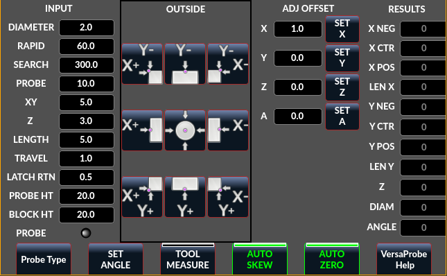
Widget for probing on a mill. Used by the QtDragon screen.
3. Dialog Widgets
Dialogs are used to present or request immediately required information in a focused way.
The typical used dialogs can be loaded using the ScreenOptions widget.
You can also add them directly to the UI - but each dialog must have a unique launch name or you will see multiple dialogs displayed, one after another.
You can show dialogs directly with Python code, but a safer way is to use STATUS messages to request the dialog to launch and to return the gathered information.
-
Register to
STATUSchannel:
To set this up, first register to catch thegeneralmessage fromSTATUS:STATUS.connect('general',self.return_value)
-
Add a function to call a dialog:
This function must build a messagedictto send to the dialog.
This message will be passed back in the general message with the addition of thereturnvariable.
It is possible to add extra user information to the message. The dialog will ignore these and pass them back.-
NAME -
Launches code name of dialog to show.
-
ID -
A unique id so we process only a dialog that we requested.
-
TITLE -
The title to use on the dialog.
def show_dialog(self):
    mess = {'NAME':'ENTRY','ID':'__test1__',
            'TITLE':'Test Entry'}
    ACTION.CALL_DIALOG, mess)
-
-
Add a callback function that processes the general message:
Keep in mind this function will get all general messages so thedictkeynames are not guaranteed to be there. Using the.get()function and/or usingtry/exceptis advisable. This function should:-
check the name and id is the same as we sent,
-
then extract the return value and any user variables.
# process the STATUS return message
def return_value(self, w, message):
    rtn = message.get('RETURN')
    code = bool(message.get('ID') == '__test1__')
    name = bool(message.get('NAME') == 'ENTRY')
    if code and name and not rtn is None:
        print('Entry return value from {} = {}'.format(code, rtn))
-
3.1. LcncDialog - General Message Dialog Widget
This is a general message dialog widget.
If there is a Focus Overlay widget present, it can signal it to display.
If the sound library is set up it can play sounds.
There are options that can be set when requesting a dialog, these would be added to the message dict.
-
TITLE -
Title of the dialog window.
-
MESSAGE -
Title message text in bold.
-
MORE -
Standard text under the heading.
-
DETAILS -
Initial hidden text.
-
TYPE(OK|YESNO|OKCANCEL) -
ICON(QUESTION|INFO|CRITICAL|WARNING) -
PINNAME -
Not implemented yet.
-
FOCUSTEXT(overlay text|None) -
Text to display if focus overlay is used. Use
Nonefor no text. -
FOCUSCOLOR(QColor(_R, G, B, A_)) -
Color to use if focus overlay is used.
-
PLAYALERT -
Sound to play if sound is available, i.e.,
SPEAK<spoken_message> .
When using STATUS 's request-dialog function, the default launch name is MESSAGE.
It is based on PyQt’s QMessagebox.
3.2. ToolDialog - Manual Tool Change Dialog Widget
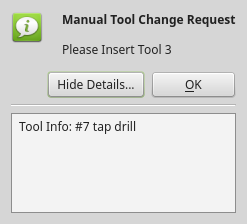
This is used as a manual tool change prompt.
It has HAL pins to connect to the machine controller. The pins are named the same as the original AXIS manual tool prompt and works the same.
The tool change dialog can only be launched by HAL pins.
If there is a Focus Overlay widget present, it will signal it to display.
It is based on PyQt’s QMessagebox.
3.3. FileDialog - Load and Save File Chooser Dialog Widget
This is used to load G-code files.
If there is a Focus Overlay widget present, it will signal it to display.
When using STATUS 's request-dialog function, the default launch names are LOAD or SAVE.
There are options that can be set when requesting a dialog, these would be added to the message dict:
-
EXTENSIONS -
FILENAME -
DIRECTORY -
An example Python call, for a load dialog:
mess = {'NAME':'LOAD','ID':'_MY_DIALOG_',
            'TITLE':'Load Some text File',
            'FILENAME':'~/linuxcnc/nc_files/someprogram.txt',
            'EXTENSIONS':'Text Files (*.txt);;ALL Files (*.*)'
            }
ACTION.CALL_DIALOG(mess)
And for a save dialog
mess = {'NAME':'SAVE','ID':'_MY_DIALOG_',
            'TITLE':'Save Some text File',
            'FILENAME':'~/linuxcnc/nc_files/someprogram.txt',
            'EXTENSIONS':'Text Files (*.txt);;ALL Files (*.*)'
            }
ACTION.CALL_DIALOG(mess)
It is based on PyQt’s QMessagebox.
3.4. OriginOffsetDialog - Origin Offset Setting Dialog Widget
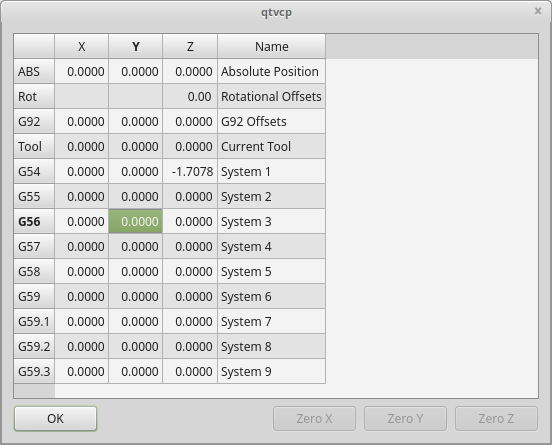
This widget allows one to modify User System origin offsets directly in a dialog form.
If there is an Focus Overlay widget present, it will signal it to display.
When using STATUS 's request-dialog function, the default launch name is ORIGINOFFSET.
It is based on PyQt’s QDialog.
3.5. ToolOffsetDialog - Tool Offset Setting Dialog Widget
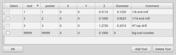
This widget allows one to modify Tool offsets directly in a dialog form.
If there is an Focus Overlay widget present, it will signal it to display.
When using STATUS 's request-dialog function, the default launch name is TOOLOFFSET.
It is based on PyQt’s QDialog.
3.6. ToolChooserDialog - Tool Chooser Dialog Widget
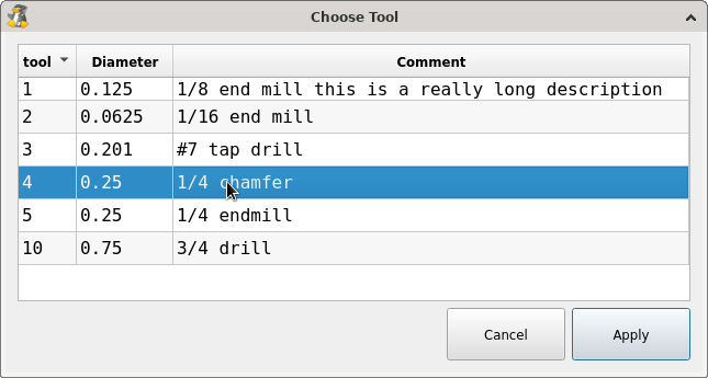
This widget allows the operator to select one of the tools defined in the tool table. If a tool is selected and Apply is pressed or the tool is double-clicked, the dialog will return the tool number selected. This can be used in conjunction with the OperatorValueLine widget to create a tool change widget, for example.
If there is an Focus Overlay widget present, it will signal it to display.
When using STATUS 's request-dialog function, the default launch name is TOOLCHOOSER.
It is based on PyQt’s QDialog.
3.7. MachineLog - Machine Events Journal Display Widget
This widget displays various log event messages that have been output by the system during the current session. This includes informational messages as well as errors.
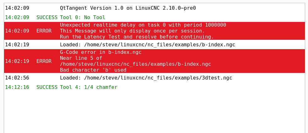
Two distinct types of logs may be displayed:
-
machine log (plain text or severity highlighted)
-
integrator log (plain text only)
The type of log shown by the widget is controlled by the option properties of the widget. By selecting machine_log_option or integrator_log_option the appropriate log will be displayed. These options will display plain styled logs in a Qt QTextEdit widget.
Additionally, there is a machine_log_severity_option property that may be chosen that will display the machine log in a variety of colors depending on the severity of the message, by using a QTableWidget. The colors may be configured with the properties of the widget.
3.7.1. Emitting Log messages with Severity
Severity is conveyed via the option value sent along with the STATUS signal called update-machine-log. The option parameter is a comma-delimited list, containing typically
``` text = an error has occurred. STATUS.emit(update-machine-log, text, TIME,ERROR) ```
3.7.2. Clearing the Log
The log may be cleared by calling the clear() method of the widget.
3.8. MacroTabDialog - Macro Launch Dialog Widget
This is a dialog to display the macrotab widget.
MacroTab displays a choice of macro programs to run using icons.
If there is a Focus Overlay widget present, it will signal it to display.
When using ``STATUS``'s request-dialog function, the default launch name is MACROTAB.
It is based on PyQt’s QDialog.
3.9. CamViewDialog - WebCam Part Alignment Dialog Widget
This is a dialog to display the CamView widget for Webcam part alignment.
When using ``STATUS``'s request-dialog function, the default launch name is CAMVIEW.
It is based on PyQt’s QDialog.
3.10. EntryDialog - Edit Line Dialog Widget
This is a dialog to display an edit line for information entry, such as origin offset.
It returns the entry via STATUS messages using a Python DICT.
The DICT contains at minimum, the name of the dialog requested and an ID code.
When using ``STATUS``'s request-dialog function, the default launch name is ENTRY.
It is based on PyQt’s QDialog.
3.11. CalculatorDialog - Calculator Dialog Widget
This is a dialog to display a calculator for numeric entry, such as origin offset, spindle RPM, etc. It is primarily intended for touchscreen use, but it has support for physical keyboard input as well.
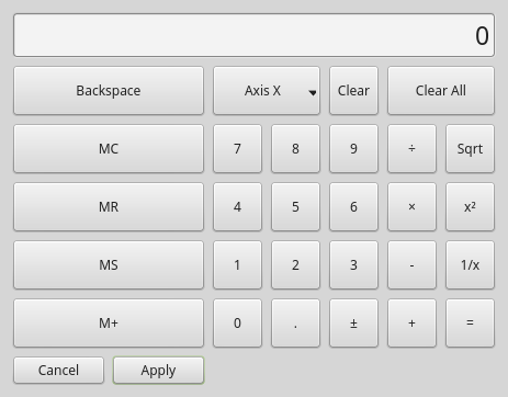
It returns the entry via STATUS messages using a Python DICT.
The DICT contains at minimum, the name of the dialog requested and an ID code.
When using ``STATUS``'s request-dialog function, the default launch name is CALCULATOR.
It is based on PyQt’s QDialog.
3.11.1. Preferences file options
In the CALCULATOR section of the preferences file the following options may be set:
-
constValuesList- A comma-delimited list of common values you might enter, that will appear on a dedicated row of buttons at the bottom of the calculator. e.g. setting to0.100, -0.100would provide two buttons for +0.100 and -0.100 which are commonly used when edge-finding on inch mills. Up to six (6) values may be entered, beyond that the list will be truncated. Values must be valid floating point or integer. -
onShowBehavior- A list of optional behaviors that will be triggered when the calculator dialog is shown. Each option must be separated by a comma.-
CLEAR_ALLto issue a Clear All each time the calculator is shown. This will clear any previously entered values from the last time the calculator was used and open with the display value set to0 -
FORCE_FOCUSwill force the focus to the calculator input field when the widget is shown. This will allow a physical keyboard to provide input to the widget properly without additional clicks. Also, it has the side-effect of selecting the current value, such that typing from a physical keyboard will replace the existing value unless the text selection is changed.
-
-
acceptOnReturnKey- If set toTrue, the calculator will accept the current value and close the dialog when the keyboard return/enter key is pressed. If set toFalse, the return key will be ignored and the Apply button must be clicked. For cases where the Apply Next button is available, the return key will perform this action instead, and the dialog will remain open.
3.11.2. Physical keyboard support
While the intent of this widget is to provide a touchscreen-friendly interface, it is possible to use a physical keyboard to enter values, typically via a numeric keypad. The keys perform mostly as one would expect, but a few special key functions also exist:
-
the Enter or Return key is equivalent to the Equal (=) operator in the cases where a calculation is pending. Otherwise it will perform the Apply function if it is enabled via the
acceptOnReturnKeypreference. -
the minus key (-) will toggle the sign of the current number in the calculator display when it is hit twice in a row. Otherwise when hit only once it will perform a subtraction operator as expected.
-
Alt+Left Arrow will perform Back function, moving to the previous field for cases where this is supported.
-
Alt+Right Arrow will perform a Next function, moving to the next field for cases where this is supported.
-
Alt+Backspace will cancel out of the calculator and not provide a return value to the calling widget.
3.12. RunFromLine - Run-From-Line Dialog Widget
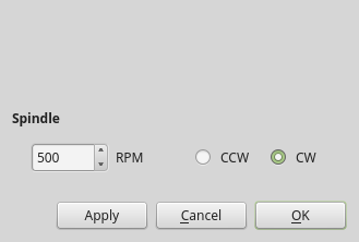
Dialog to preset spindle settings before running a program from a specific line.
It is based on PyQt’s QDialog.
3.13. VersaProbeDialog - Part Touch Probing Dialog Widget
This is a dialog to display a part probing screen based on Verser Probe v2.
It is based on PyQt’s QDialog.
3.14. MachineLogDialog - Machine and Debugging Logs Dialog Widget
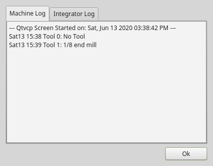
This is a dialog to display the machine log and QtVCP’s debugging log.
It is based on PyQt’s QDialog.
4. Other Widgets
Other available widgets:
4.1. NurbsEditor - NURBS Editing Widget
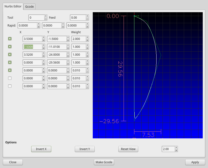
The Nurbs editor allows you to manipulate a NURBS based geometry on screen and then convert NURBS to G-code.
You can edit the G-code on screen and then send it to LinuxCNC.
It is based on PyQt’s QDialog.
4.2. JoyPad - 5 button D-pad Widget
It is the base class for the HALPad widget.
This widget looks and acts like a 5 button D-pad, with a LED like indicators in a ring.
You can put text or icons in each of the button positions.
You can connect to output signals when the buttons are pressed.
There are also input slots to change the color of the indicator(s).
There are enumerated constants used to reference indicator positions.
They are used in Qt Designer editor’s property editor or in Python code.
-
NONE -
LEFT,L -
RIGHT,R -
CENTER,C -
TOP,T -
BOTTOM,B -
LEFTRIGHT,X -
TOPBOTTOM,A -
For Python handler code, you use the widget name in Qt Designer plus the reference constant:
self.w.joypadname.set_highlight(self.w.joypadname.LEFT)
def _pressedOutput(self, btncode):
    self.joy_btn_pressed.emit(btncode)
    self[''.format(btncode.lower())].emit(True)

def _releasedOutput(self, btncode):
    self.joy_btn_released.emit(btncode)
    self['joy_{}_pressed'.format(btncode.lower())].emit(False)
As coded these function issue (emit) PyQt5 signals (joy_btn_pressed and joy<letter>_pressed) for the any button pressed or released_.
Signal joy_btn_pressed outputs a string code for the button.
Signal joy_<letter>_pressed outputs a bool value.
You could override the functions to do something else if making a custom widget:
-
reset_highlight() -
Clears the highlight indicator.
-
set_highlight(_button_, state=_True_) -
Set the highlight indicator in position
buttonto statestate.
You can use strings letters (LRCTBXA) or positionENUMSfor the button argument. -
set_button_icon(_button_, _pixmap_) -
Sets the button’s icon pixmap.
-
set_button_text(_button_, _text_) -
Sets the button’s icon text.
-
set_tooltip(_button_, _text_) -
Sets the buttons pop-up tooltip descriptive text.
-
setLight(_state_) -
Sets the highlight indicator to the
Truecolor orFalsecolor.
Theset_highlight()function must be used prior to set the indicator to use.
These signals will be sent when buttons are pressed.
They can be connected to in Qt Designer editor or Python code.
The first two output a string that indicates the button pressed:
-
joy_btn_pressed(string) -
joy_btn_released(string) -
joy_l_pressed(bool) -
joy_l_released(bool) -
joy_r_pressed(bool) -
joy_r_released(bool) -
joy_c_pressed(bool) -
joy_c_released(bool) -
joy_t_pressed(bool) -
joy_t_released(bool) -
joy_b_pressed(bool) -
joy_b_released(bool) -
They are based on PyQt’s Signal (QtCore.pyqtSignal())
Slots can be connected to in Qt Designer editor or Python code:
-
set_colorStateTrue() -
set_colorStateFalse() -
set_colorState(_bool_) -
set_true_color(_str_) -
set_true_color(_qcolor_) -
set_false_color(_str_) -
set_false_color(_qcolor_) -
These can be set in stylesheets or Python code:
-
highlightPosition -
Fastsett indikatorposisjonen.
-
setColorState -
Select the color state of the indicator.
-
left_image_path -
right_image_path -
center_image_path -
top_image_path -
bottom_image_path -
A file path or resource path to an image to display in the described button location.
If the reset button is pressed in Qt Designer editor property, the image will not be displayed (allowing optionally text). -
left_text -
right_text -
center_text -
top_text -
bottom_text -
A text string to be displayed in the described button location.
If left blank an image can be designated to be displayed. -
true_color -
false_color -
Color selection for the center LED ring to be displayed, when the
BASENAME.light.centerHAL pin isTrueorFalse. -
text_color -
Color selection for the button text.
-
button_font -
Font selection for the button text.
The above properties could be set in:
-
Stylesheets:
You would usually use the Qt Designer widget name with#prefix to set individual widget properties, otherwise you would use theJoyPadclass name to set allJoyPadwidgets the same:#joypadname{ qproperty-true_color: #000; qproperty-false_color: #444; }
-
In Python handler code:
self.w.joypadename.setProperty('true_color','green')
self.w.joypadename.setProperty('false_color','red')
4.3. WebWidget
This widget will create a html/pdf viewing page using the QtWebKit or QtWebEngine libraries. The newer QtWebEngine is preferred if both are on the system.
If the QtWebEngine library is used with the Qt Designer editor, a placeholder QWidget will show in Qesigner. This will be replaced with the QtWebEngine widget at run time.
5. BaseClass/Mixin Widgets
These widgets are used to combine different properties and behaviours into other widgets.
You will see them as a collapsible header in the Qt Designer properties column.
5.1. IndicatedPushButtons
This class modifies QPushButton behaviour.
5.1.1. Indicator Option
indicator_option puts a LED on the top of the button.

It can be a triangle, circle, top bar, or side bar.
The triangle and circle LEDs can display double vertical LEDs optionally each with it’s own HAL pin. + The size and position can be adjusted.
It will indicate:
-
the current state of the button, or
-
tilstanden for en HAL-pinne, eller
-
LinuxCNC status.
These properties are available to customize the indicator (not all are applicable to every LED shape):
-
doubleIndicator -
With triangle or round LEDs add a second vertical LED.
-
on_color -
off_color -
flashIndicator -
When the indicator is true, flash the LED on and off.
-
flashRate -
Rate of the flashing
-
indicator_size -
Size of triangle LED
-
circle_diameter -
Diameter of round LED
-
shape_option -
0-4 LED shape type
-
right_edge_offset -
Space from right edge
-
top_edge_offset -
Space from top edge
-
height_fraction -
Used for bar Leds
-
width_fraction -
Used for bar Leds
-
corner_radius -
Indicator corner radius.
The LED indicator color can be defined in a stylesheet with the following code added to the .qss file:
Indicated_PushButton{
  qproperty-on_color: #000;
  qproperty-off_color: #444;
}
Or for a particular button:
Indicated_PushButton #button_estop{
  qproperty-on_color: black;
  qproperty-off_color: yellow;
}
IndicatedPushButton have exclusive options:
-
indicator_HAL_pin_option -
Adds a
halpin, named<buttonname>-ledthat controls the button indicator state. -
indicator_status_option -
Makes the LED indicate the state of these selectable LinuxCNC status:
-
Is Estopped
-
Is On
-
All Homed
-
Is Joint Homed
-
Idle
-
Paused
-
Flood
-
Mist
-
Block Delete
-
Valgfritt stopp
-
Manual
-
MDI
-
Auto
-
Spindle Stopped
-
Spindle Forward
-
Spindle Reverse
-
On Limits
Some
indicator_status_optionsholds a property that can be used with a stylesheet to change the color of the button based on the state of the property in LinuxCNC.
Currently these status properties can be used to auto style buttons:-
is_estopped_statuswill toggle theisEstopproperty -
is_on_statuswill toggle theisStateOnproperty -
is_manual_status,is_mdi_status,is_auto_statuswill toggle theisManual,isMDI,isAutoproperties. -
is_homed_statuswill toggle the isAllHomed property
-
Here is a sample stylesheet entry setting the background of mode button widgets when LinuxCNC is in that mode:
ActionButton[isManual=true] {
    background: red;
}
ActionButton[isMdi=true] {
    background: blue;
}
ActionButton[isAuto=true] {
    background: green;
}
Here is how you specify a particular widget by its objectName in Qt Designer:
ActionButton #estop button [isEstopped=false] {
    color: yellow;
}
5.1.2. Enabled by LinuxCNC State
Often, having the button disabled and enabled based on the state of LinuxCNC’s motion controller is necessary.
There are several properties that can be selected to aid with this:
-
isAllHomedSentive -
isOnSensitive -
isIdleSensitive -
isRunSensitive -
isRunPausedSensitive -
isManSensitive -
isMDISensitive -
isAutoSensitive -
You can select multiple properties for combined requirements.
5.1.3. Text Changes On State
Choosing the checked_state_text_option allows a checkable button to change the text based on its checked state.
It uses the following properties to specify the text for each state:
-
true_state_string -
false_state_string -
\\nwill be converted to a newline.
You can set/change these in stylesheets:
ActionButton #action_aux{
  qproperty-true_state_string: "Air\\nOn";
  qproperty-false_state_string: "Air\\nOff";
}
5.1.4. Call Python Commands On State
The python_command_option allow small snippets of Python code to be run from the push of a button, without having to edit the handler file. Though, it can call functions in the handler file.
When using the command_string properties.
-
true_python_cmd_string -
A Python command that will be called when the button is toggled
True. -
false_python_cmd_string -
A Python command that will be called when the button is toggled
False.
Special capitalized words will give access to the following:
-
INSTANCE -
Will give access to the widgets instances and handler functions.
E.g.,INSTANCE.my_handler_function_call(True) -
ACTION -
Will give access to QtVCP’s
ACTIONlibrary.
E.g.,ACTION.TOGGLE_FLOOD() -
PROGRAM_LOADER -
Will give access to QtVCP’s
PROGRAM_LOADERlibrary.
E.g.,PROGRAM_LOADER.load_halshow() -
HAL -
Will give access to HAL’s Python module.
E.g.,HAL.set_p('motion.probe-input','1')
6. Import-Only Widgets
These widgets are usually the base class widget for other QtVCP widgets.
They are not available directly from the Qt Designer editor but could be imported and manually inserted.
They could also be subclassed to make a similar widget with new features.
6.1. Auto Height
Widget for measuring two heights with a probe.
For setup.
6.2. G-code Utility
Widgets for performing common machining processes.
6.3. Facing
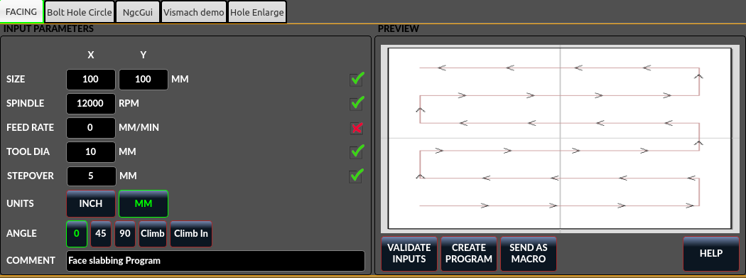
Slab or face a definable area with different strategies.
6.4. Hole Circle
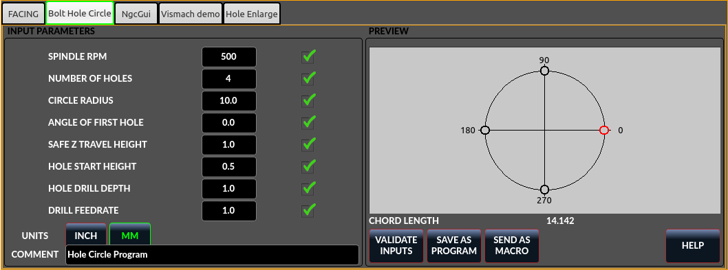
Drill multiple holes on a bolt hole circle.
6.5. Hole Enlarge
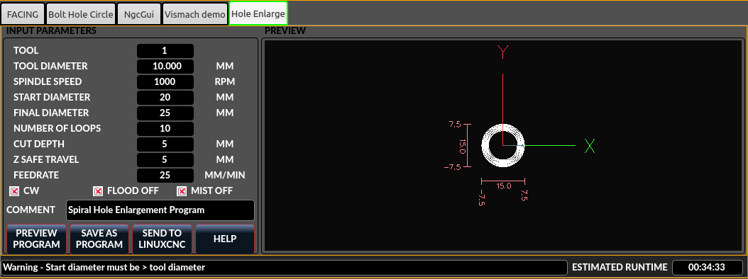
Use an end mill to enlarge a drilled hole.
6.6. Qt NGCGUI
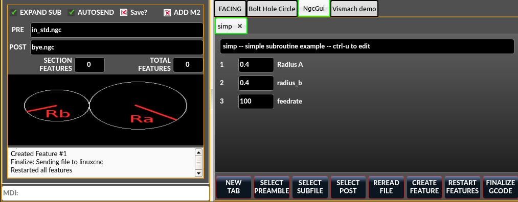
QtVCP’s version of NGC subroutine selector (Shown as used in QtDragon).
6.6.1. INI settings
LinuxCNC needs to know where to look to run the subroutines.
If the subroutine calls other subroutines or custom M codes, those paths must be added too.
[RS274NGC]
SUBROUTINE_PATH = ~/linuxcnc/nc_files/examples/ngcgui_lib:~/linuxcnc/nc_files/examples/ngcgui_lib/utilitysubs
QtVCP needs to know where to open subroutines from.
You can also specify subroutines to be pre-opened in tabs.
[DISPLAY]
# NGCGUI subroutine path.
# This path must also be in [RS274NGC] SUBROUTINE_PATH
NGCGUI_SUBFILE_PATH = ~/linuxcnc/nc_files/examples/ngcgui_lib
# pre selected programs tabs
# specify filenames only, files must be in the NGCGUI_SUBFILE_PATH
NGCGUI_SUBFILE = slot.ngc
NGCGUI_SUBFILE = qpocket.ngc
6.6.2. Knapper
-
NEW TAB - add new blank tab to NGCGUI
-
SELECT PREAMBLE - select a file that add preamble G-code
-
SELECT SUBFILE - select a NGCGUI subroutine file
-
SELECT POST - select a file that add post G-code
-
REREAD FILE - reload the subroutine file
-
CREATE FEATURE - add feature to the list
-
RESTART FEATURE - remove all features from the list
-
FINALIZE GCODE - create the full G-code and send it to LinuxCNC/a file
6.6.3. Adding Custom Subroutines
You can create your own subroutines for use with NGCGUI. They must follow these rules:
-
For creating a subroutine for use with NGCGUI, the filename and the subroutine name must be the same.
-
The subroutine must be in a folder within LinuxCNC’s INI designated search path.
-
On the first line there may be a comment of type info:
-
The subroutine must be surrounded by the sub and endsub tags.
-
The variables used must be numbered variables and must not skip number.
-
Comments and presets may be included.
-
If an image file of the same name is in the folder, it will be shown.
(info: feedrate -- simple example for setting feedrate)
o<feedrate> sub
    #<feedrate>       = #1 (= 6 Feed Rate) ; comments in brackets will be shown in ngcui
    f#<feedrate>
o<feedrate> endsub
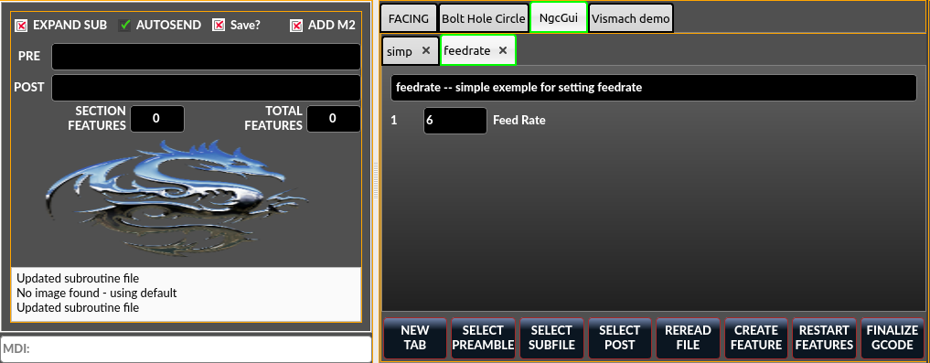
6.7. Qt PDF
Allows adding loadable PDFs to a screen.
6.8. Qt Vismach
Use this to build/add OpenGl simulated machines.
6.9. Hal Selection Box
This widget is combobox that will allows selection of a pin or signal on the system.
from qtvcp.widgets.hal_selectionbox import HALSelectionBox

    def buildComboBox(self):
        # combo box for HAL pin selection
        combobox = HALSelectionBox()
        combobox.setShowTypes([combobox.PINS,combobox.SIGNALS])
        combobox.setPinTypes([combobox.HAL_BIT], direction = [combobox.HAL_IN])
        combobox.setSignalTypes([combobox.HAL_BIT], driven = [False,True])
        combobox.hal_init()
        combobox.selectionUpdated.connect(lambda w: self.signalSelected(w))

    def signalSelected(self, sig):
        print('Watching:',sig)
Det er funksjonskall
# set the list of types to show from: PINS SIGNALS
combobox.setShowTypes([combobox.PINS])

# set the pin types to show: HAL_BIT,HAL_FLOAT,HAL_S32,HAL_U32
# and a list of directions: HAL_IN HAL_OUT
combobox.setPinTypes(types=[combobox.HAL_BIT], direction = [HAL_IN])

# set the signal types to show: HAL_BIT,HAL_FLOAT,HAL_S32,HAL_U32
# and a list of driven/undriven (by a connected pin) to show
combobox.setSignalTypes( types=[combobox.HAL_BIT], driven = [True,True])