Qtscreen uses QTvcp widgets for linuxcnc integration.
Widget is the general name for the UI objects such as buttons and labels in QTpy.
You are free to use any available widgets in the QTDesigner editor.
There are also special widgets made for linuxcnc that make integration easier.
This are split in two heading on the right side of the editor.
One is for HAL only widgets.
The other is for cnc control widgets.
you are free to mix them in any way on your panel.
|
Note
|
This description of widget properties can easily be out of date due to further development and lack of people to write docs (A good way to give back to the project). The definitive descriptions are found by looking in the source code. |
1. HAL Only Widgets
These Widgets usually have HAL pins and don’t react to the machine Controller
1.1. XEmbed Widget
Allows one to embed program into the widget.
only programs that utilize the xembed protocol will work such as:
-
gladevcp virtual control panels
-
Onboard virtual keyboard
-
qtvcp virtual control panels
-
mplayer video player
1.2. Slider Widget
Allows one to adjust a HAL pins using a sliding pointer.
1.3. LED Widget

An indicator that optionally follows a HAL pin’s logic.
-
halpin_option -selects if the LED follows an input HAL pin or program state.
-
diameter -diameter of the LED
-
color - Color of the LED when on.
-
off_color - Color of the LED when off.
-
alignment - Qt Alignment hint.
-
state -current state of LED
-
flashing -turns flashing option on and off.
-
flashRate -sets the flash rate.
The LED properties can be defined in a stylesheet with the following code added to the .qss file.
The name_of_led would be the name defined Designer’s editor.
LED #name_0f_led{
qproperty-color: red;
qproperty-diameter: 20;
qproperty-flashRate: 150;
}
1.4. Checkbox Widget
This widget allows the user to check a box to set a HAL pin true or false.
It is based on pyQT’s QCheckButton
1.5. Radio Button Widget
This widget allows a user to set HAL pins true or false.
Only one widget of a group can be true at a time.
It is based on pyQT’s QRadioButton
1.6. Push Button Widget
This widget allows a user to set a HAL pin true or false.
as an option it can be a toggle button.
It also has other options:
1.6.1. LED indicator option
Indicator_option puts a LED on the top of the button.
It can be a triangle, circle, top bar or side bar.
The size and position can be adjusted
It will indicated the current state of the button, the state of a HAL pin or linuxcnc status.
Use properties to customized the indicator (not all are applicable to every LED shape).
on_color
off_color
indicator_size
circle_diameter
shape_option
right_edge_offset
top_edge_offset
height_fraction
width_fraction
corner_radius
The LED indicator color can be defined in a stylesheet with the following code added to the .qss file.
Indicated_PushButton{
qproperty-on_color: #000;
qproperty-off_color: #444;
}
or for a particular button:
Indicated_PushButton #button_estop{
qproperty-on_color: black;
qproperty-off_color: yellow;
}
Indicated PushButtons have exclusive options:
-
indicator_HAL_pin_option
-
indicator_status_option
Indicator_HAL_pin_option will add a halpin, using the button name + -led, that controls the
button indicator state.
indicator_status_option will make the LED indicate the state of these selectable linuxcnc status:
Is Estopped
Is On
All Homed
Is Joint Homed
Idle
Paused
Flood
Mist
Block Delete
Optional Stop
Manual
MDI
Auto
Spindle Stopped
Spindle Fwd
Spindle Reverse
On Limits
1.6.2. Text changes on state
Choosing the checked_state_text_option allows a checkable button to change the text based
on it’s checked state. It uses the properties true_state_string and false_state_string
to specify the text for each state.
1.6.3. Call python commands on state
The python_command_option allow small snippets of python code to be run from the push of a button,
with out having to edit the handler file. (though it can call functions in the handler file)
When using the command_string properties.
true_python_cmd_string - a python command that will be called when the button is toggled true
false_python_cmd_string - a python command that will be called when the button is toggled false
The capitalized word INSTANCE will give access to the widgets instances and handler functions.
eg. INSTANCE.my_handler_function_call(True)
The capitalized word ACTION will give access to qtvcp’s ACTION library.
eg. ACTION.TOGGLE_FLOOD()
The capitalized word PROGRAM_LOADER will give access to qtvcp’s PROGRAM_LOADER library.
eg. PROGRAM_LOADER.load_halshow()
The capitalized word HAL will give access to HAL’s python module.
eg. HAL.set_p('motion.probe-input,1)'
It is based on pyQT’s QpushButton
1.7. Focus Overlay Widget
This widget places a coloured overlay over the screen usually while a dialog is showing.
Used to create a focused feel and to draw attention to critical information.
It can also show a translucent image.
It can also display message text and buttons.
This widget can be controller with STATUS messages.
1.8. Grid Layout Widget
This widget controls if the widgets inside it are enabled or disabled.
disabled widgets are typically a different colour and do not respond to actions.
It is based on pyQT’s QGridLayout
1.9. HAL Label Widget
This widget displays values sent to it from HAL pins, programically or a QtSignal.
The input pin can be selected as Bit, S32, Float or no pin selected.
There is a text Template property to set the rich text and/or to format the text.
Basic formatting might be, for bool: %r, for interger: %d, for float: %0.4f.
A rich text example might be:
self.w.my_hal_label.setProperty(textTemplate,"""
<html><head/><body><p><span style=" font-size:12pt;
font-weight:600; color:#f40c11;">%0.4f</span></p></body></html>
""")
The setDisplay slot can be connected to a integer, float or bool signal.
If the property pin_name is not set the widet name will be used.
There are function calls to display values:
-
[HALLabelName].setDisplay(some_value) can be used to set the display if no HAL pin is selected.
-
[HALLabelName].setProperty(textTemplate,"%d") - set the template of the display.
It is based on pyQT’s QLabel
1.10. LCD Number Widget
This widget displays HAL float values in a LCD looking way.
It is based on pyQT’s QLCDNumber
1.11. DoubleScale Widget
This widget is a spin button entry widget.
used for setting a s32 and float HAL pin.
It has an internal scale factor, set to a default of 1, that can be set programmically or using a QtSignal.
The scale defaults to 1
he setInput slot can be connected to a integer, or float signal.
There is a function call to change the internal scaling factor:
-
[HALLabelName].setInput(some_value)
The HAL pins will be set to the value of the internal scale times the widget displayed value.
1.12. CamView Widget
This widget displays a image from a web camera.
It overlays an adjustable circular and cross hair target over the image.
Camview was built with precise visual positioning in mind.
1.13. GeneralHALInput Widget
This widget is used to connect an arbitrary QT widget to HAL using signals/slots.
It is used for widgets that should respond to HAL pin changes.
1.14. GeneralHALOutput Widget
This widget is used to connect an arbitrary QT widget to HAL using signals/slots.
It is used for widgets that should control HAL pins.
1.15. WidgetSwitcher Widget
This is used to switch the view of a multi-widget layout to show just one widget.
This might be used to flip between a large view of a widget or a smaller multi widget view.
I’ts different from a stacked widget as it can pull a widget from anywhere in the screen and
place it in it’s page with a different layout then it originally had.
The original widget must be in a layout for switcher to put it back.
In Designer you will add the widgetswitcher widget on screen.
Right click the widgetswitcher and add a page,
then populate it with widgets/layouts you wish to see in a default form.
Then add as many pages as there are views to switch to.
on each page add a layout widget.
After adding the layout you must right click the widget switcher again
and set the layout option.
click on the widgetswitcher widget and then scroll to the botton of the property editor.
you are looking for the dynamic property widget_list.
double click the to the right of the widget_list property.
A dialog will pop up allowing you to add the names of the widgets to move to the pages you added to the widgetswitcher.
There are function calls to display specific widgets:
-
[WidgetSwitcherName].show_id_widget(number)
-
[WidgetSwitcherName].show_named_widget(widget_name)
-
[WidgetSwitcherName].show_default()
-
[WidgetSwitcherName].show_next()
By calling one of these functions, you control what widget
is currently displayed. show_default() shows the page 0
layout, and puts all other widgets back to where they were as initially built in Designer.
It is based on the QStack widget.
2. Machine Controller Widgets
These widgets interact to the Machine Controller state.
2.1. Action Button Widget
These buttons are used to control action of the machine controller.
They are built on top of indicator_buttons so can have LEDs overlaid.
|
Note
|
If you left double click on this widget you can launch a dialog to set any of these action. The dialogs will help to set the right related data to the selected action. You can also change these properties directly in the property editor. |
You can select one of these actions:
Estop
Machine On
Auto
mdi
manual
run
run_from_line status (gets line number from STATUS message gcode-line-selected)
run_from_line slot (gets line number from designer int/str slot setRunFromLine)
abort
pause
load dialog (requires a dialog widget present)
Camview dialog (requires camview dialog widget present)
origin offset dialog (requires origin offset dialog widget present)
macro dialog (requires macro dialog widget present)
Launch Halmeter
Launch Status
Launch Halshow
Home (set the joint number to -1 for all-home)
Unhome (set the joint number to -1 for all-unhome)
Home Selected Homes the joint/axis selected by STATUS
Unhome Selected Unhomes the joint/axis selected by STATUS
zero axis
zero G5X zeros the current user coordinate system offsets
zero G92 zeros the optional G92 offsets
zero Z rotational zeros the rotation offset
jog joint positive (set the joint number)
jog joint negative (set the joint number)
jog selected positive (selected with a different widget or STATUS)
jog selected negative (selected with a different widget or STATUS)
jog increment (set metric/imperial/angular numbers)
jog rate (set the float/alt float number)
feed override (set the float/alt float number)
rapid override (set the float/alt float number)
spindle override (set the float/alt float number)
spindle fwd
spindle backward
spindle stop
spindle up
spindle down
view change (set view_type_string)
limits override
flood
mist
block delete
optional stop
mdi command (set command_string)
INI mdi number (set ini_mdi_number)
dro absolute
dro relative
dro dtg
exit screen Closes down linuxcnc
Override limits Temporarily override hard limits
launch dialogs pops up dialogs if they are included in ui file.
set DRO to relative
set DRO to absolute
set DRO to distance-to-go
These set attributes of the selected action. Availability depends on the widget.
toggle float option - allows jog rate and overrides to toggle between two rates
joint number - selects the joint/axis that the button controls
incr imperial number - sets the imperial jog increment (set negative to ignore)
incr mm number -sets the metric jog increment (set negative to ignore)
incr angular number -sets the angular jog increment (set negative to ignore)
float number - used for jograte and overrides
float alternate number -for jograte and overrides that can toggle between two float numbers
view type string - can be p, x, y, y2, z, z2, clear, zoom-in, zoom-out, pan-up, pan-down,
pan-left, pan-right, rotate-up, rotate-down, rotate-cw, rotate-ccw
command string - MDI command string that will be invoked if the MDI command action is selected.
ini_mdi_number - a reference to the INI file [MDI_COMMAND_LIST] section.
Set an integer of select one line under the INI’s MDI_COMMAND line starting at 0.
Then in the INI file, under the heading [MDI_COMMAND_LIST] add a line:
MDI_COMMAND=<some command>
Action buttons are subclasssed from indicated_PushButton
2.1.1. LED indicator option
Indicator_option puts a LED on the top of the button.
It can be a triangle, circle, top bar or side bar.
The size and position can be adjusted
It will indicated the current state of the button, the state of a HAL pin or linuxcnc status.
Use properties to customized the indicator (not all are applicable to every LED shape).
on_color
off_color
indicator_size
circle_diameter
shape_option
right_edge_offset
top_edge_offset
height_fraction
width_fraction
corner_radius
The LED indicator color can be defined in a stylesheet with the following code added to the .qss file.
Indicated_PushButton{
qproperty-on_color: #000;
qproperty-off_color: #444;
}
or for a particular button:
Indicated_PushButton #button_estop{
qproperty-on_color: black;
qproperty-off_color: yellow;
}
Indicated PushButtons have exclusive options:
-
indicator_HAL_pin_option
-
indicator_status_option
Indicator_HAL_pin_option will add a halpin, using the button name + -led, that controls the
button indicator state.
indicator_status_option will make the LED indicate the state of these selectable linuxcnc status:
Is Estopped
Is On
All Homed
Is Joint Homed
Idle
Paused
Flood
Mist
Block Delete
Optional Stop
Manual
MDI
Auto
Spindle Stopped
Spindle Fwd
Spindle Reverse
On Limits
2.1.2. Text changes on state
Choosing the checked_state_text_option allows a checkable button to change the text based
on it’s checked state. It uses the properties true_state_string and false_state_string
to specify the text for each state.
2.1.3. Call python commands on state
The python_command_option allow small snippets of python code to be run from the push of a button,
with out having to edit the handler file. (though it can call functions in the handler file)
When using the command_string properties.
true_python_cmd_string - a python command that will be called when the button is toggled true
false_python_cmd_string - a python command that will be called when the button is toggled false
The capitalized word INSTANCE will give access to the widgets instances and handler functions.
eg. INSTANCE.my_handler_function_call(True)
The capitalized word ACTION will give access to qtvcp’s ACTION library.
eg. ACTION.TOGGLE_FLOOD()
The capitalized word PROGRAM_LOADER will give access to qtvcp’s PROGRAM_LOADER library.
eg. PROGRAM_LOADER.load_halshow()
The capitalized word HAL will give access to HAL’s python module.
eg. HAL.set_p('motion.probe-input,1)'
Indicated PushButtons and Actionbuttons are based on pyQT’s QPushButton
2.2. RoundButton
Round buttons work the same as ActionButtons other then the button is cropped round.
They are intended only to be visually different.
They have two path properties for displaying images on true and false.
2.3. Axis Tool Button
This allows one to select and set an AXIS.
If the button is set checkable, it will indicate which axis is selected.
If you press and hold the button a pop up menu will show allowing one to:
-
Zero the axis
-
divide the axis by 2
-
set the axis arbitrarily
-
reset the axis to the last number recorded
You select the axis by setting the joint number
You can select a halpin option that is set true when the axis is selected
It is based on pyQT’s QToolButton
2.4. Camview Widget
This is used to align the work piece or zero part features using a webcam.
It uses opencv vision library.
2.5. DRO Widget
This will display the current position of an axis.
Qjoint_number
Qreference_type
metric_template
imperial_template
angular_template
It is based on pyQT’s QLabel
2.6. GcodeDisplay
It is based on pyQT’s
2.7. GcodeEditor Widget
This displays Gcode in text form. It will highlight the currently running line.
This can also display MDI history when linuxcnc is in MDI mode.
This can also display log entries when linuxcnc is in MANUAL mode.
This will also display preference file entries if you enter PREFERENCE in capitals
into the MDILine widget.
It has a signal percentDone(int) that that can be connected to a slot (such as a
progressBar to display percent run)
It is based on pyQT’s QsciScintilla
2.8. GCodeGraphics Widget
This Displays the current Gcode in a graphical form.
_view _dro _dtg _metric overlay _offsets background_color
2.8.1. ACTION functions
The ACTION library can control the gcode graphics widget.
ACTION.RELOAD_DISPLAY() -reload the current program which recalculates the origin/offsets.
ACTION.SET_GRAPHICS_VIEW(view) The following commands can be sent:
clear
zoom-in
zoom-out
pan-up
pan-down
pan-right
pan-left
rotate-cw
rotate-ccw
rotate-up
rotate-down
overlay-dro-on
overlay-dro-off
overlay-offsets-on
overlay-offsets-off
alpha-mode-on
alpha-mode-off
inhibit-selection-on
inhibit-selection-off
dimensions-on
dimensions-off
grid-size
P
X
Y
Y2
Z
Z2
ACTION.ADJUST_PAN(X,Y) -directly set the relative pan of view in x and y direction
ACTION.ADJUST_ROTATE(X,Y) -directly set the relative rotation of view in x and y direction
It is based on pyQT’s opengl widget.
2.9. StateLabel Widget
This will display a label based on true/false states of the machine controller.
You can select different text based on true or false.
You can use Rich text for different fonts/colours etc.
These states are selectable:
CSS Mode
Diameter Mode
FPR Mode
Metric Mode
It is based on pyQT’s QLabel
2.10. StatusLabel Widget
This will display a label based on variable states of the machine controller.
You can change how the state will be display by substituting
You can use Rich text for different fonts/colors etc.
These states are selectable:
CSS Mode
Feed Override
Rapid Override
Spindle Override
Jograte
Jogincr
Tool Number
Current Feedrate
Requested Spindle Speed
User System
It is based on pyQT’s QLabel
2.11. StatusImageSwicher Widget
Status image switcher will switch between images based on linuxcnc states.
watch spindle would toggle between 3 images ( stop, fwd, revs)
watch axis homed would toggle between 2 images ( axis not homed, axis homed)
watch all homed would toggle between 2 images ( not all homed, all homed)
watch hard limits would toggle between 2 images or one per joint
Here is an example of using it to display an icon of Z axis homing state:
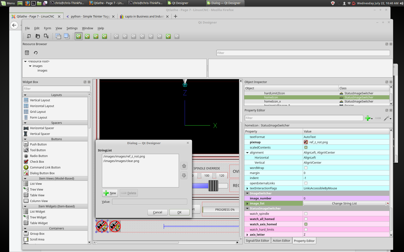
In the properties section notice that:
watch axis homed is checked
axis letter is set to Z
If you double click the image list a dialog will show and allow you to add image paths to.
If you have one image as an icon and one clear image then that will look like it shows and hides the icon.
Selecting image paths can be done by selecting the pixmap property and selecting an image.
Note: The pixmap setting is for test display only and will be ignored outside of Designer.
Right click the image name and you should see copy path
Click copy path
Now double click the image list property so the dialog shows.
Click the New button
Paste the image path in the entry box
Do that again for the next image - use a clear image to represent a hidden icon.
You can test display the images from the image list by changing the image number
In this case 0 is unhomed 1 would be homed
This is for test display only and will be ignored outside of Designer.
2.12. StatusStacked
This widget displays one of three panels based on linuxcnc’s mode.
This allows you to automatically display different widgets on Manual, MDI and Auto modes.
todo
It is based on pyQT’s QStacked widget.
2.13. Jog Increments Widget
This widget allows the user to select jog increment values for jogging.
The jogging values come from the INI file under: [DISPLAY], INCREMENTS
or [DISPLAY], ANGULAR_INCREMENTS
This will be available to all widgets through STATUS.
You can select linear or angular increments by the property linear_option
in Designer property editor.
It is based on pyQT’s combobox
2.14. ScreenOption widget
This widget doesn’t add anything visually to a screen but sets up important
options. This is the preferred way to use these options
-
notify_option: Hooking into the desktop notification bubbles for error and messages
-
catch_close_option: catching the close event to pop up a are you sure prompt
-
catch_error_option: monitoring the linuxcnc error channel. This also sends the message
through STATUS to anything that registers -
play_sounds_option: playing sounds using beep, espeak and the system sound
-
use_pref_file_option: setting up a preference filepath
Using the magic word WORKINGFOLDER in the preference file path will be replaced with
the launched configuration path ie. WORKINFOLDER/my_preferences -
embedded_program_option: Embed programs defined in the INI. There is a property for a default
location.
-
focusOverlay_option: Focus_overlay will put an image or colored panel over the main
screen to emphasize focus to an external event - typically a dialog.
-
messageDialog_option: sets up the message dialog - used for general messages
-
closeDialog_option: sets up the standard close screen prompt dialog
-
entryDiallog_option: sets up the numerical entry dialog
-
toolDialog_option: sets up the manual tool change dialog, incuding HAL pin.
-
fileDialog_option: sets up the file choosing dialog.
-
vesaProbe_option: sets up the vera style probe dialog
-
macroTabeDialog_option: sets up the macro selection dialog
-
camViewDialog_option: sets up the camera alignment dialog
-
toolOffset_option: sets up the tool offset display/editor dialog
-
originOffset_option: sets up the origin display/editor dialog
-
calculatorDialog_option: sets up the calcylatory entry dialog
-
machineLogDialog_option: sets up a dialog to display logs from the machine and qtvcp
2.15. StatusSlider Widget
This widget allow the user to adjust linuxcnc setting via a slide.
-
Jog rate
-
Angular jog rate
-
Feed rate
-
spindle override rate
-
Rapid override rate
It is based on pyQT’s QSlider
2.16. State LED Widget
This widget gives status on the selected linuxcnc state.
The state options are:
-
is_paused_status
-
is_estopped_status
-
is_on_status
-
is_idle_status_
-
is_homed_status
-
is_flood_status
-
is_mist_status
-
is_block_delete_status
-
is_optional_stop_status
-
is_joint_homed_status
-
is_limits_overridden_status
-
is_manual_status
-
is_mdi_status
-
is_auto_status
-
is_spindle_stopped_status
-
is_spindle_fwd_status
-
is_spindle_rev_status
-
is_spindle_at_speed_status
There are properties that can be changed:
-
halpin_option - Adds an output pin that reflects selected state
-
invert_state_status - Invert the LED state compared to the linuxcnc state.
-
diameter -Diameter of the LED
-
color - Color of the LED when on.
-
off_color - Color of the LED when off.
-
alignment - Qt Aliment hint.
-
state - Current state of LED (for testing in designer)
-
flashing - Turns flashing option on and off.
-
flashRate - Sets the flash rate.
The LED properties can be defined in a stylesheet with the following code added to the .qss file.
The name_of_led would be the name defined Designer’s editor.
State_LED #name_0f_led{
qproperty-color: red;
qproperty-diameter: 20;
qproperty-flashRate: 150;
}
It is based on the LED widget
2.17. StatusAdjustmentBar
This widget allows setting values using buttons while displaying a bar.
It also has an optional hi/low toggle button that can be held down to set the
levels.
-
Jog rate
-
angular jog rate
-
Feed rate
-
Spindle override rate
-
Rapid override rate
It is based on pyQT’s QProgressBar
2.18. SystemToolButton
This widget allows you to manually select a user system by pressing and holding.
If you don’t set the button text it will automatically update to the current system.
It is based on pyQT’s QToolButton
2.19. MacroTab Widget
This Widget allows a user to select and adjust special macro programs for
doing small jobs.
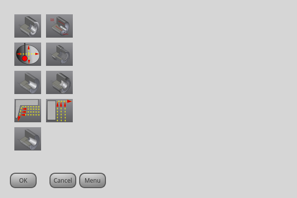
It uses images for visual representation of the macro and for an icon.
It searches for special macros using the INI definition:
[RS274NGC]
SUBROUTINE_PATH =
The macros are Oword subroutine with special comments to work with the launcher.
The first three lines must have the keywords: (The forth is optional)
Here is a sample fr the forst four lines in an Oword file:
; MACROCOMMAND=Entry1,Entry2
; MACRODEFAULTS=0,true
; MACROIMAGE=my_image.svg,Icon layer number, Macro layer number
; MACROOPTIONS=load:yes,save:yes,default:default.txt,path:~/macros
2.19.1. MACROCOMMAND
This is the first line in the Oword file.
It is a comma separated list of text to display above an entry.
There will be one for every variable required in the Oword function.
If the macro does not require variables, only add ; MACROCOMMAND=
2.19.2. MACRODEFAULT
This must be the second line in the Oword file.
It is a comma separated list of the default values for each variable in the Oword function.
If you use the word true or false in the list, a checkbutton will be shown.
2.19.3. MACROIMAGE
This must be the third line in the Oword file.
if using a SVG image file, the must end b .svg
The image must be added to an svg layer.
It uses layers to define different images for macro and icon.
The first entry will be the SVG image file name.
It is assumed to be in the same folder as the Oword file.
The second item will be the image layer.
the optional third entry will be the icon layer.
If the third entry is missing, the same image will be used for macro and icon.
If using a png/jpg image file .
The first entry is the image filename.
It is assumed the image file are in the same folder an the macro.
The optional second entry will be the icon filename.
If the second entry is missing the same image will be used for macro and image.
If the keyword is present but the entries are missing , no images will be used.
2.19.4. MACRODEFAULT
This optional line must be the forth line in the Oword file.
It is a comma separated list of keyword and data.
-
LOAD:yes - show a load button
-
SAVE:yes -show a save button
2.20. MDILine Widget
One can enter MDI commands here. A popup keyboard is available
There are also embedded commands available from this Widget.
Type, in all capitals, any of these commands to load the respective program:
-
HALMETER
-
HALSHOW
-
HALSCOPE
-
STATUS
-
CALIBRATION
-
CLASSICLADDER
-
PREFERENCE - Loads the preference file onto the gcodeEditor
It is based on pyQT’s QLineEdit
2.21. MDIHistory
Displays a scrollable list of past MDI command.
A edit line is embedded for MDI commands.
There are also embedded commands available from this Widget
Type, in all capitals, any of these commands to load the respective program:
-
HALMETER
-
HALSHOW
-
HALSCOPE
-
STATUS
-
CALIBRATION
-
CLASSICLADDER
-
PREFERENCE - Loads the preference file onto the gcodeEditor
The history is recorded on a file defined in the INI.
under the heading [DISPLAY] (this shows the default)
MDI_HISTORY_FILE = '~/.axis_mdi_history'
2.22. MDITouchy
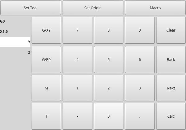
This widget display button and entry lines for use with entering MDI commands.
It is based on Linuxcnc’s Touchy screen’s MDI entry process.
It’s large buttons are most useful for touch screens.
To use MDITouchy, first press one of the G/XY, G/RO, M or T button.
On the left, will show the current line that can be filled out, then press Next for the next line.
Calc will pop up a calculator dialog.
Clear clears th ecurrent entry.
Back allows you to change previous line entries.
The widget requires an explicied call to MDITouchu’s python code to actually run the MDI command
For handler file code: if the widget was named mditouchy in designer, this command would
run the displayed MDI command.
self.w.mditouchy.run_command()
For action button use: if the widget was named mditouchy in designer,
use the action button’s Call python commands option and enter:
INSTANCE.mditouchy.run_command()
The macro button will cycle though macro’s defined in the INI heading [DISPLAY]
add one or more 'MACRO = ' lines. Each should be of the format:
MACRO = increment xinc yinc
In this example, increment is the name of the macro, and it accepts two parameters, named xinc and yinc.
Now, place the macro in a file named increment.ngc, in the
PROGRAM_PREFIX directory or any directory in the SUBROUTINE_PATH.
(specified in the INI file)
It should look like:
O<increment> sub
G91 G0 X#1 Y#2
G90
O<increment> endsub
Notice the name of the sub matches the file name and macro name exactly,
including case.
When you invoke the macro by pressing the Macro button
you can enter values for xinc and yinc. These are
passed to the macro as #1 and #2 respectively. Parameters you
leave empty are passed as value 0.
If there are several different macros, press the Macro button
repeatedly to cycle through them.
In this simple example, if you enter -1 for xinc and invoke the running of the
MDI cycle, a rapid G0 move will be invoked, moving one unit to
the left.
This macro capability is useful for edge/hole probing and other setup
tasks, as well as perhaps hole milling or other simple operations
that can be done from the panel without requiring specially-written
gcode programs.
2.23. OriginOffsetView Widget
This widget allows one to modify User System origin offsets directly
It will update the table for changes made internally by linuxcnc.
It is based on pyQT’s
2.24. State Enable Gridlayout Widgets
This is a container that other widgets can be placed in.
It will grey-out (disable) the widgets inside it depending on linuxcnc’s current state.
It can selectably react to:
-
machine on
-
interpreter idle
-
estop off
-
all-homed
It is based on pyQT’s QGridLayout
2.25. MachineLog
It is based on pyQT’s
2.26. JointEnableWidget
It is based on pyQT’s
2.27. StatusImageSwitcher
This widget will display images based on linuxcnc status.
You can watch:
-
the state of the spindle.
-
the state of all homed
-
the state of a certain axis homed
-
the state of hard limits
It is based on pyQT’s
2.28. FileManager
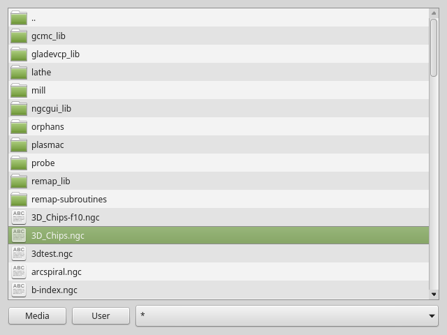
This widget is used to select files to load.
It has a the ability to scroll the names with hardware such as a MPG.
one can class patch the function load(self,fname): to customize file loading.
the function getCurrentSelected() will return a python touple, containing
the file path and whether it’s a file.
temp = FILEMANAGER.getCurrentSelected()
print 'filepath={}'.fomat(temp[0])
if temp[1]:
    print 'Is a file'
It is based on pyQT’s
2.29. RadioAxisSelector
It is based on pyQT’s
2.30. BasicProbe
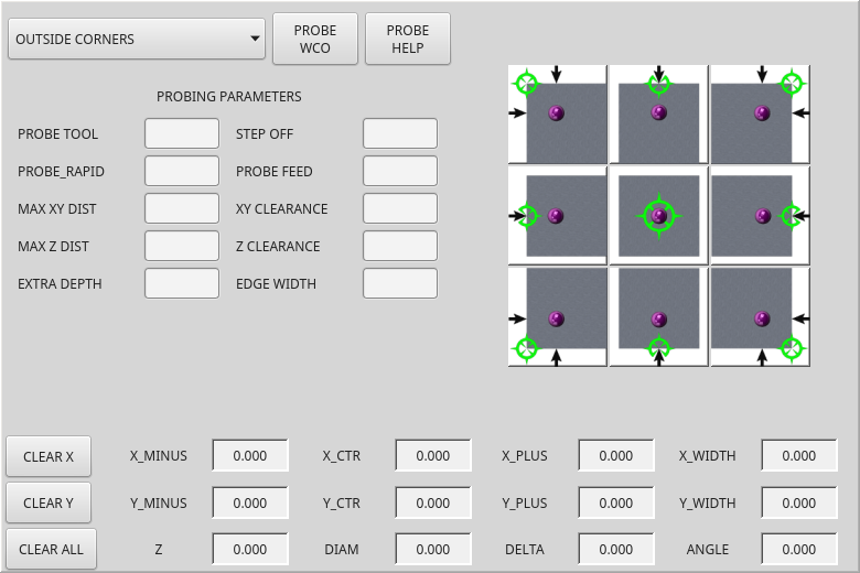
Widget for probing on a mill.
requires extra analog motion pins for probe settings.
3. Dialog Widgets
Dialogs are used to present or request immediately required information in a focused way.
The typical used dialogs can be loaded using the screenoptions widget.
You can also add them directly to the ui - but each dialog must have a unique launch name
or you will see multiple dialogs displayed, one after another.
You can show dialogs directly with python code but a safer way is to use STATUS messages to
request the dialog to launch and to return the gathered information.
To set this up first register to catch the general message from STATUS:
STATUS.connect('general',self.return_value)
Add a function to call a dialog:
This function must build a message DICT to send to the dialog.
This message will be passed back in the general message with the addition
of the RETURN variable. It is possible to add extra user information to the message.
The dialog will ignore these and pass them back.
NAME = launch code name of dialog to show.
ID = a unique id so we process only a dialog that we requested.
TITLE = the title to use on the dialog
        def show_dialog(self):
            mess = {'NAME':'ENTRY','ID':'__test1__',
                    'TITLE':'Test Entry'}
            ACTION.CALL_DIALOG, mess)
Add a callback function that processes the general message:
This function should check the the name and id is the same as
we sent, then it can extract the return value and any user variables.
Keep in mind this function will get all general messages so the DICT keynames
are not guaranteed to be there. Using the .get() function and or using try/except
is advisable.
    # process the STATUS return message
    def return_value(self, w, message):
        rtn = message.get('RETURN')
        code = bool(message.get('ID') == '__test1__')
        name = bool(message.get('NAME') == 'ENTRY')
        if code and name and not rtn is None:
            print ('Entry return value from {} = {}').format(code, rtn)
3.1. Lcnc_Dialog
This is a general message dialog widget.
If there is an Focus Overlay widget present, it can signal it to display.
If the sound library is set up it can play sounds.
There are options that can be set when requesting a dialog, these would be added to
the message dict.
-
TITLE:'Attention' -Title of the dialog window
-
MESSAGE:'your text' -Title message text in bold
-
MORE:'your more text' - standard text under the heading
-
DETAILS:'hidden text' - initial hidden text
-
TYPE:'OK' -type can be OK, YESNO, OKCANCEL
-
ICON:'INFO' -icon can be QUESTION,INFO,CRITICAL,WARNING
-
PINNAME -not implemented yet
-
FOCUSTEXT:None -text to display if focus overlay is used. Use None for no text.
-
FOCUSCOLOR:QColor(0, 0, 0, 150) - color to use if focus overlay is used
-
PLAYALERT :'SPEAK alert!'- sound to play if sound is available
When using STATUS’s request-dialog function, the default launch name is MESSAGE
It is based on pyQT’s QMessagebox
3.2. Dialog Tool Change Widget
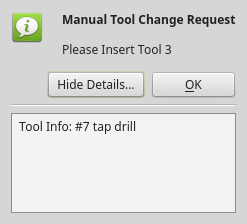
This is used as a manual tool change prompt.
It has HAL pins to connect to the machine controller
The pins are named the same as the original AXIS manual tool prompt and works the same.
the tool change dialog can only be launched by HAL pins.
If there is a Focus Overlay widget present, it will signal it to display.
It is based on pyQT’s QMessagebox
3.3. Dialog File Chooser Widget
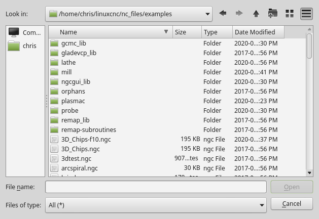
This is used to load Gcode files
If there is a Focus Overlay widget present, it will signal it to display.
When using STATUS’s request-dialog function, the default launch names are LOAD or SAVE
There are options that can be set when requesting a dialog, these would be added to
the message dict.
-
EXTENSIONS
-
FILENAME
-
DIRECTORY
An example python call, for a load dialog:
mess = {'NAME':'LOAD','ID':'_MY_DIALOG_',
            'TITLE':'Load Some text File',
            'FILENAME':'~/linuxcnc/nc_files/someprogram.txt',
            'EXTENSIONS':'Text Files (*.txt);;ALL Files (*.*)'
            }
ACTION.CALL_DIALOG(mess)
And for saving
mess = {'NAME':'SAVE','ID':'_MY_DIALOG_',
            'TITLE':'Save Some text File',
            'FILENAME':'~/linuxcnc/nc_files/someprogram.txt',
            'EXTENSIONS':'Text Files (*.txt);;ALL Files (*.*)'
            }
ACTION.CALL_DIALOG(mess)
It is based on pyQT’s QMessagebox
3.4. Dialog Origin Offset Widget
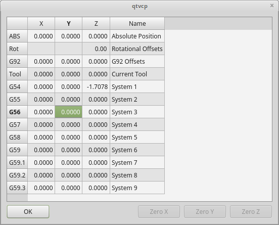
This widget allows one to modify User System origin offsets directly
It is in a dialog form
If there is an Focus Overlay widget present, it will signal it to display.
When using STATUS’s request-dialog function, the default launch name is ORIGINOFFSET
It is based on pyQT’s QDialog
3.5. Dialog tool Offset Widget
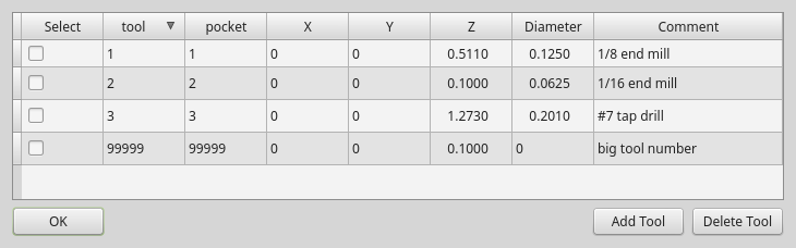
This widget allows one to modify Tool offsets directly
It is in a dialog form
If there is an Focus Overlay widget present, it will signal it to display.
When using STATUS’s request-dialog function, the default launch name is TOOLOFFSET
It is based on pyQT’s QDialog
3.6. Dialog MacroTab
This is a dialog for displaying the macrotab widget.
Macrotab displays a choice of macro programs to run using icons.
If there is a Focus Overlay widget present, it will signal it to display.
When using STATUS’s request-dialog function, the default launch name is MACROTAB
3.7. Dialog camview
This is a dialog to display the camview object for Webcam part alignment.
When using STATUS’s request-dialog function, the default launch name is CAMVIEW
It is based on pyQT’s QDialog
3.8. Dialog entry
This is a dialog to display an edit line for information entry, such as origin offset.
It returns the entry via STATUS messages using a python DICT.
The DICT contains at minimum, the name of the dialog requested and an id code.
When using STATUS’s request-dialog function, the default launch name is ENTRY
It is based on pyQT’s QDialog
3.9. Dialog Calculator
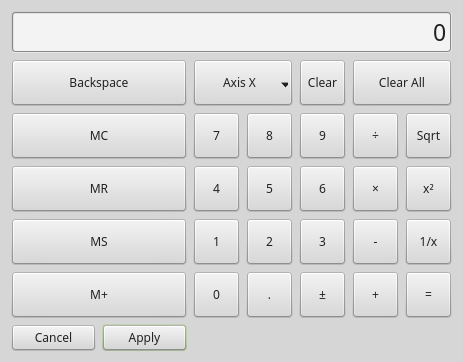
This is a dialog to display a calculator for numeric entry, such as origin offset.
It returns the entry via STATUS messages using a python DICT.
The DICT contains at minimum, the name of the dialog requested and an id code.
When using STATUS’s request-dialog function, the default launch name is CALCULATOR
It is based on pyQT’s QDialog
3.10. Dialog Run From Line
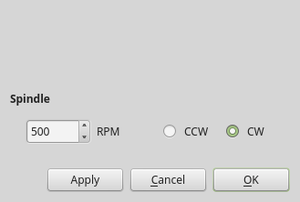
Dialog to preset spindle settings before running a program from a specific line.
3.11. Dialog VersaProbe
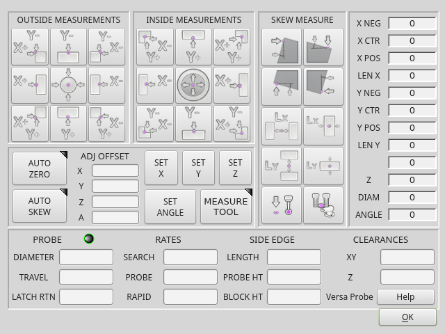
This is a dialog to display A probing screen based on Versa Probe.
It is based on pyQT’s QDialog
3.12. Dialog MachineLogDialog
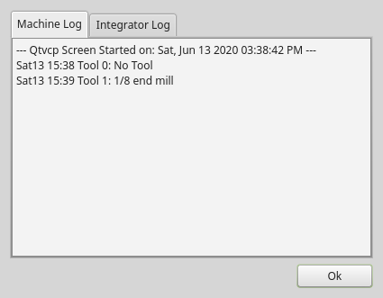
This is a dialog to display the user machine log and qtvcp’s debugging log.
It is based on pyQT’s QDialog
4. Other
Other available widgets
4.1. Nurbs Editor
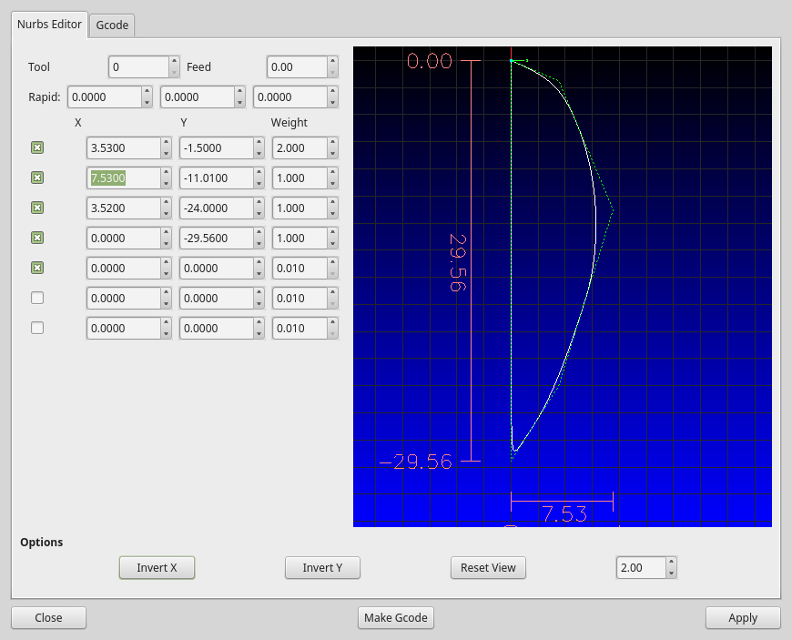
The Nurbs editor allows you to manipulate a nurbs based geometry on screen and then
convert this to gcode. you can edit the gcode on screen and then send it to linuxcnc.